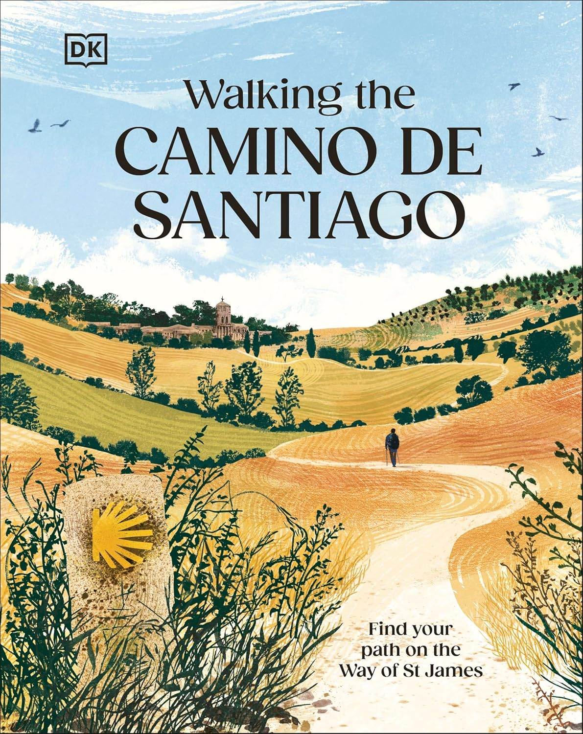
Mapping the Camino de Santiago
An overview of the work I carried out to produce the maps for the DK book
Walking the Camino de Santiago, published January 2026.
All hi-resolution map images are taken from promotional material supplied by DK. Any work in progress images are from archive and/or occasionally recreated. All opinions are my own and have no connection to the publishers.
Pilgrimage Plotting and Planning
Reaching from the furthest edges of Europe and beyond, the sprawling network of paths leading to Santiago de Compostela in Northern Spain seems to take on the form of a river network with its tributaries meandering and merging as they make their way toward the city's cathedral, home of the remains of Saint James the Apostle.
It is one of the greatest and most popular long distance walks, regularly tackled in small manageable segments while others walk from start to finish in one gruelling undertaking. There is no right or wrong way to approach the journey, be it with religious intent or secular curiosity, its story is born through personal achievement and community.
Getting Started
For pilgrims and hikers alike, the
Camino de Santiago is a huge undertaking spanning many weeks and months of planning. As a result, hundreds of guidebooks and maps have been printed over the years to help the traveller forward toward
Santiago de Compostela. The travel team at
DK wanted to publish something beautiful to introduce those who had heard of the pilgrimage but perhaps not dived deeply into the history or logistics. This was to be a welcoming introduction to the most common routes, stories and mythology.
It was designed to be a beautiful large format gift book rather than a small practical guide. The practical guides are brilliantly precise in their explanation of routes, usually focusing on just a single selected Camino from the start up to the doors of the cathedral, but this can be overkill for a reader who is interested in discovering the differing routes' variety. It can also be overwhelming when confronted by books and maps forensically outlining the pilgrimage which are more suited to later in the planning process or on the road.
The book was always intended to be a celebration of this spiritual journey.
Design
As with all new titles, it is critical to lock in the design direction from the start. The designers will look at what has already been published and then build a design which will be in-keeping with DK's style while also avoiding replicating any existing products. A design mood board is created by the design lead to introduce the rest of the team to looks, colours, typefaces and styles in a loose and engaging way. This helps everyone understand how the book will feel.
Once the mood board has been circulated and the team are familiar with the broad visual environment the designer is working in, the different layouts and styles are gradually locked in place and the
Adobe inDesign templates are created. This gives the rest of the design department the styles, typefaces and colour swatches to work from. This was also where the map styles would begin to be drawn together.
Illustration
From the very start of the project the senior designer had flagged an illustrator they were keen to commision,
Claire Harrup. The maps needed to align with the style of the illustrator without mimicing or attempt to replicate Claire's fantastic work, mainly as the amount of cartography meant I was not able to commission actual illustrations of each map. I was also approaching the map elements from a cartographic angle, so had restrictions on what I could and could not show for clarity.
Map Research
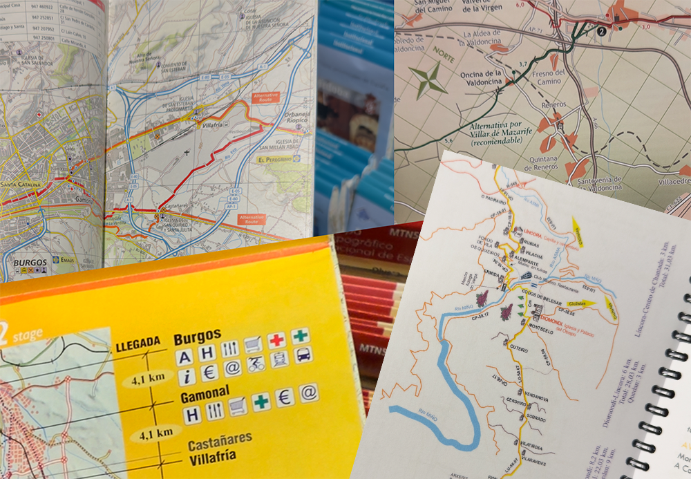
As soon as the possibility of the book was raised I had began to gather examples of interesting hiking map styles so I could have an illustrated discussion with the design team regarding mapping direction once the mood boards had been circulated. The ideas are usually just screenshots or photos, I tend to squirrel away copies of interesting maps that I discover day-to-day for just such a situation. These litter my photo library and are a fantastic creative spark when building the map design.
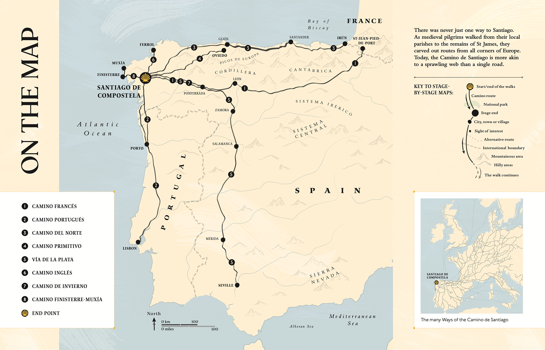
The Routes
Deciding which of the hundreds of Camino routes to include in the book was a decision taken at the start of the project. The physical size of the book and the limitation of 224 pages all come into play when dividing the pages. Strangely, the larger the book the less likely it is to sell, there is something overbearing and unwieldy in a 400 page book as it becomes too heavy to hold, difficult to store and transport. The huge gift books are impressive gifts but dreadful to read. I often see adverts for enormous Taschen books sold with accompanying stands for thousands of pounds and wonder which financial corporate office reception they are destined to gather dust in.
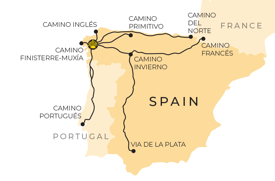
The authors and editor selected eight routes which are the most established.
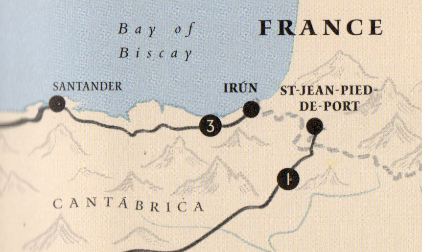
• CAMINO FRANCÉS
The
Camino Francés (the
French Route) starts in the French town of
Saint-Jean-Pied-de-Port just across the French border and makes its way through the
Pyrenees'
Roncevaux Pass and on through the Spanish countryside passing cities such as
Léon and
Pamplona. As mentioned in the book, 180,000 pilgrims make this trip each year covering just under 500 miles.
• CAMINO PORTUGUÉS
Heading north from the city of
Lisbon,
the
Portuguese Route can be split at a later stage to either hug the coast or continue a straighter route inland, the later taking 380 miles to reach the cathedral.
• CAMINO DEL NORTE
The Cantabrian Sea is the star along the Northern Route which hugs cliffs and crosses marshes and estuaries. Passing through Santander and Ribadeo before turning inland along the Masma River toward Santiago de Compostela. At 500 miles or so this is another long Camino.
• CAMINO PRIMITIVO
Known as the
Original Way, this is the oldest of the walks, first trod by
King Alfonso II
in the 9th century. It's a mountainous route with plenty of historical sights and natural beauty. To complete the hike it will take a fortnight to cover the 200 miles.
• VIA DE LA PLATA
The longest route in the book which snakes its way from the heart of Seville over 600 miles from the doors of the cathedral. The Silver Way (its translation) is a much less travelled route suited to the experienced hiker. This Camino is particularly gruelling in the summer heat.
• CAMINO INGLÉS
The English Route technically begins in the heart of County Durham in the north of England. There is a route from here to the ferry port in Southampton but this section starts at either A Coruña or Ferrol, the towns whose docks welcome the pilgrims. This is the shortest route and only just sneaks in over the necessary 62 miles to qualify as a pilgrimage.
• CAMINO INVIERNO
The 'Winter Way' is a newer route to allow pilgrims to make the journey in the north year round. Only officially approved in 2016 it avoids the more severe mountains of the Camino Primitivo as it heads west toward Santiago de Compostela.
• CAMINO FINISTERRE-MUXÍA.
An oddity, as this is a trail away from the cathedral to the 'edge of the world', the dramatic shoreline at Finisterre. A further continuation of the route to the north to visit the town of Muxía is possible.
Accuracy vs Aesthetics vs Clarity
As previously mentioned, there are already many guides to the Camino routes on the shelves, mostly focusing on a specific route giving step-by-step instructions. These are brilliant resources for the hikers and are usually small enough to fit in a backpack giving support as the journey progresses. This book however was more an inspirational overview, allowing more creative freedom in producing the maps.
The 'overview' nature of the book called for larger scale maps, meaning that the accuracy was relevant only in regard to the relative locations and distance. We included where a route curves, followed rivers or avoided mountains, but the scale meant a more generalised depiction. This allowed the reader to understand the nature and progression of the journey relating to the text. It allowed us to emphasis what was important and offset what was less so. The expectation is if the reader is to actually start a Camino they will take an in-depth guide, plan on detailed
CNIG (IGN)
paper maps or select an up to date digital navigation tool.
Data Sources
As with all maps used in commercial products, I needed a detailed paper trail to show that there was no copyright infringement during any part of their creation. Despite map data increasingly being more casually captured, shared and adapted with technological changes and social media adaptation, I was budgetarily tied to open source data and the content provided from the authors.
All sights and locations mentioned in the author's text were plotted on a digital map (Google) which was then exported to QGIS to lay on top of Openstreetmap and Natural Earth data.
Not every location mentioned in the text was shown on the maps but from an initial starting point it is always better to have everything in place and available than have to return to the files at a later stage.
Relief
To indicate the type of landscapes the Caminos passed through I wanted to include a representations of the physical relief (hills and mountains). I tested a few ideas based around the use of contour layers (tinted fills rather than singular lines) and hillshading. Both were created using Opentopography data run through QGIS. These worked fine but the resulting maps were in conflict with the illustrated design. Too scientific and precise in feel.
Thankfully I had a rare budget allowance to commission the illustrator to produce a collection of mountain and hill profiles shapes. These I requested to range in severity from smooth to jagged, the latter representing more heavily mountainous areas. When they returned they were beautiful and exactly what I had requested and I immediately embedded them on the maps. I carefully scanned the illustrations and converted to vector paths to place within the
Adobe Illustrator map files. This allowed the integration of the mountains and hills into the file's digital structure and also freed the files from requiring repeated logging of linked image files on the companies digital library.
This of course meant the same brush styles and techniques used on the beautiful illustrations now being submitted were able to be brought into the maps. I liked the really subtle hint toward the world of fantasy mapping which has a huge following.
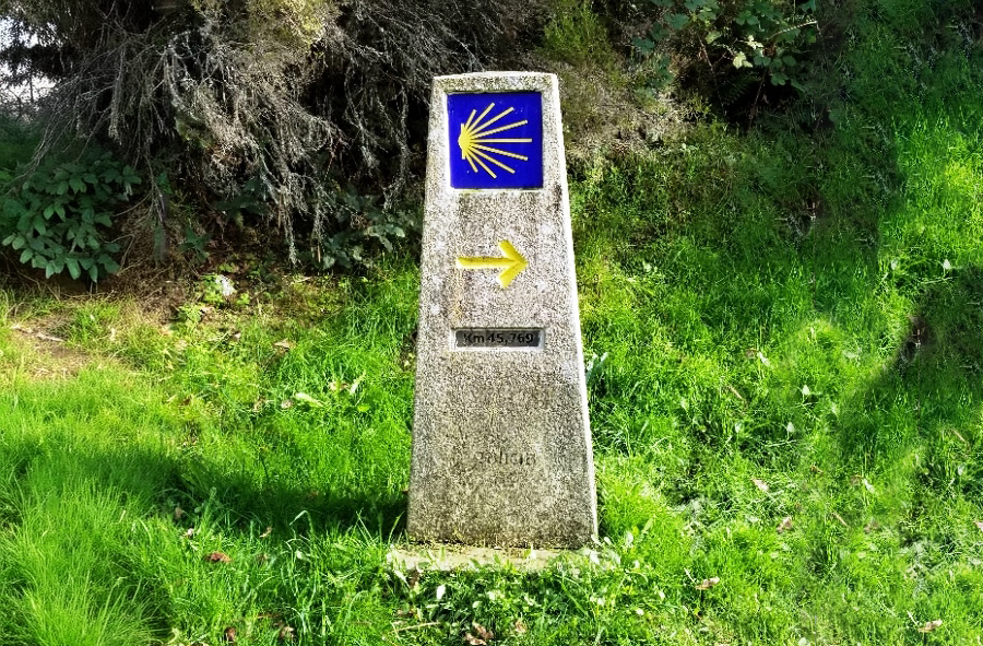
Shell symbol
The symbol for the Camino is a yellow scallop seashell, echoing the convergence of the routes at the cathedral. This shell can be found pointing the way toward the cathedral from signs and gate posts as you walk. The symbol was to be heavily integrated into the book design appearing on the cover illustration, endpapers as small embellishments throughout. I was keen to integrate the icon on to the maps.
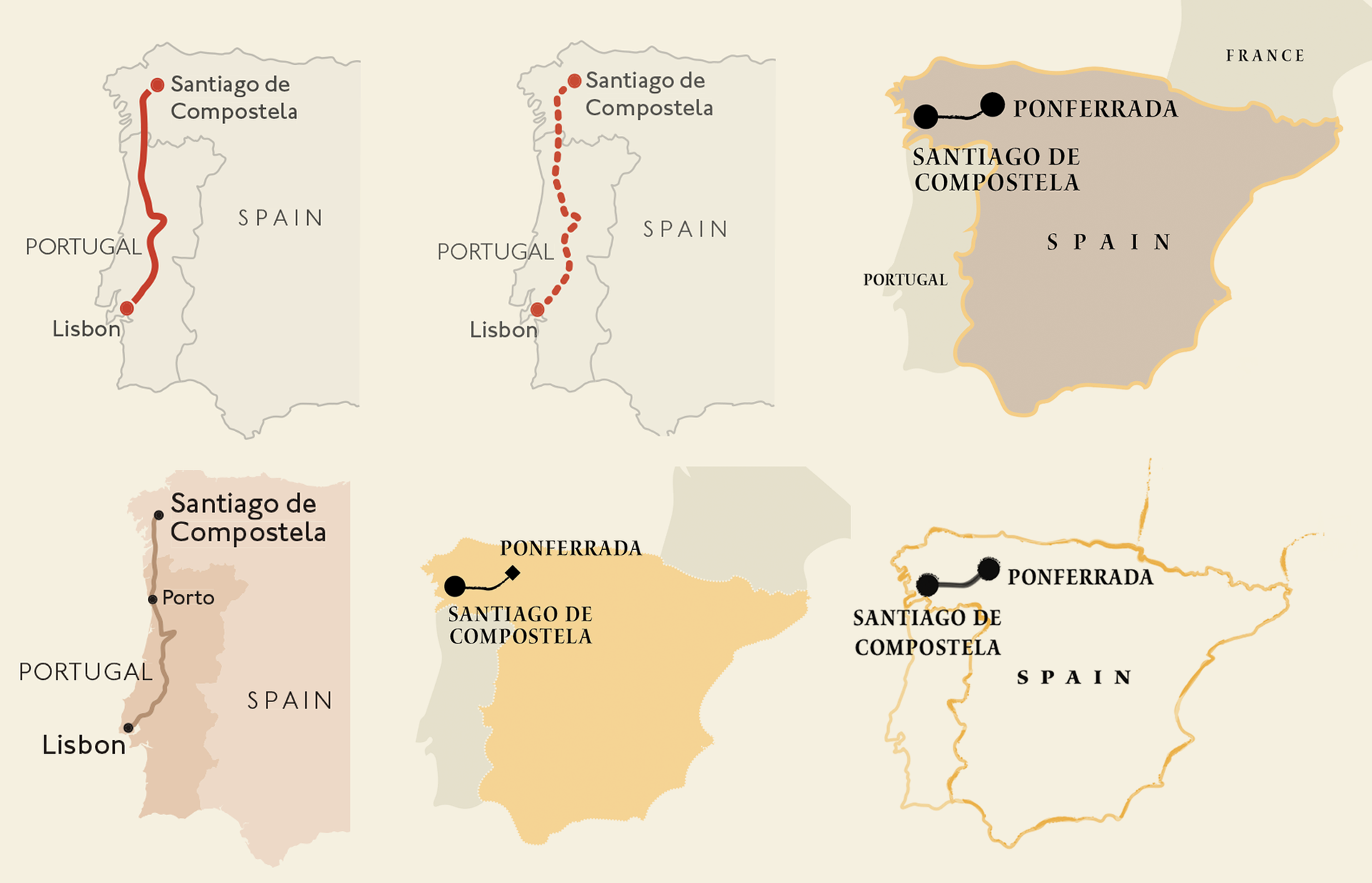
I investigated using the symbol as a repeating pattern to make the actual route, but his was a non-starter as it brought too much noise to the map. I also tied using an adapted version as a progress arrow along side the route line to give direction. In the end I found it worked best sparingly and so was used to distinguish the start and end point of each route, the symbol appearing within the black town stamps.
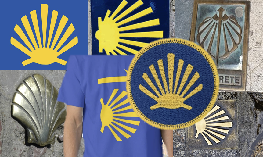
The symbol I used was created by hand drawing a segmented sea shell, this was drawn at a large scale then reduced to roughly an icon's size (roughly 80px squared at 100%), the artwork needed simplification to suit the size reduction but it worked well.
Across all maps the town symbol is a consistent black circle with a slightly jagged edge. As the route was to be split into sub-routes the towns which acted as dividing points needed to be clearly identified. I had originally planned on having the route line split either side of these symbols with the circle being modified for easy identification. This did work but on the smaller route maps it was less graceful. I instead increased the size of the town stamp to show the importance of the location. This was not hugely successful as it does look overpowering and, if there was one change to the mapping in the book I would make, it would be to revisit these largest dots and finesse them a little further.
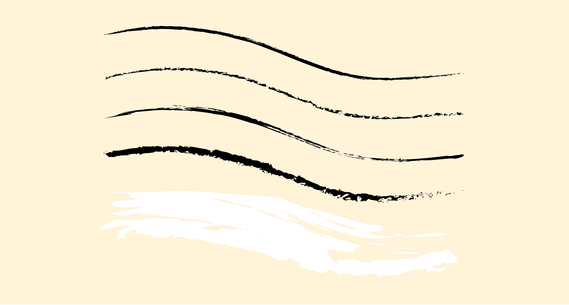
Brush Stokes
The maps were built using vector linework (as with all DK's maps) allowing edits to be make to the position, width and style of all elements but the illustrated elements in the book were produced in Photoshop using raster structure (small grids of colour value). To match the styles the maps needed to use specific brush styles and transparency styles to appear 'drawn'.
The maps were produced using a wide variety of brush styles and brush widths, the white mask brush alone held five or six styles, these inconsistent weights and widths are what really bring handmade feeling. The lines themselves were imported as a single long element but, when adding a brush style, the characteristic is pulled across the whole length singularly. To create a more natural appearance the line was split at places to mimic the hand being raised from the page. The single line elements were maintained for future use but hidden on layers beneath the artwork;
Never delete anything that you could possibly need in the future.
An Illustrated background
As well as supplying the collection of mountains and hills, the illustrator also provided a texture sheet which I used to represent land. Each route/chapter was given an indexed colour to categorise each
Camino. This is a regular technique used to divide up a book as the page's appearances will instantly change as you flick through the pages dividing the routes.
These swatches were evolving and changing as the book progressed and were still 'live' until the final proofs were returned and assessed a few days before the book went to print. Colour changes were simple as the chosen colour swatch to be used were modifying a greyscale image (the illustrator's work). Changing the colour was done by opening the file and changing the colour swatch library which automatically updated the treated images.
I had earlier experimented by giving the water a texture that suggested waves. Initial tests were interesting but it really was too heavy and clashed with the map's purpose and also the differing chapter colours. In the end a single blue colour was used across the texture.
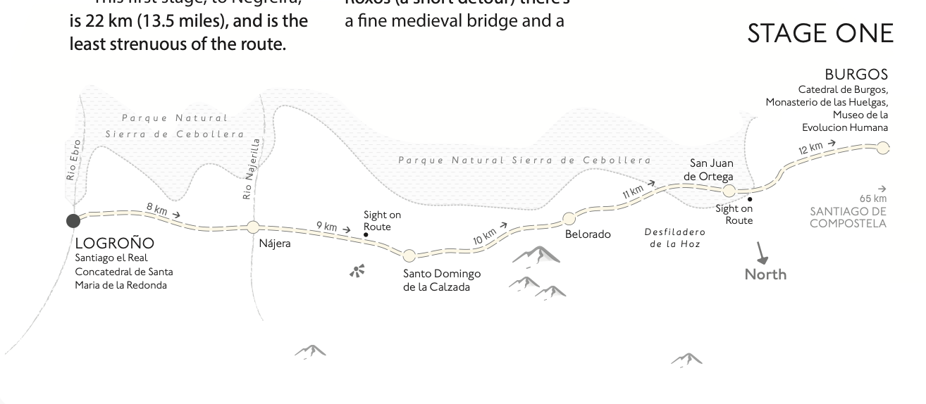
Feeding the design team - Splitting the routes and sizing maps
The routes by their nature are long and narrow. To map them clearly without taking over a whole page or squashing detail meant they would have to be split. Having multiple maps in a chapter changes the amount of available space for both text and imagery so I needed to supply the design team with approximate dimensions for each map as early as possible.
The maps were not going to be framed but had a brushed edge, meaning that the exact size and shape was not known until the map was finally drawn and checked. I created initial mock-ups for each of the maps using raw Openstreetmap data and scaled / skewed the files within object frames within the inDesign spreads until I could supply the sizes.
The split points for each map had to be at the end of a segment of the route to match the divisions in the text. I also included enough of the continuing route meaning the following map linked smoothly.
Locators
At the start of each of the chapters I drew a small locator map to show the full route in relation to the Iberian peninsula. It was a quick reference so the reader did not have to return to the overview map earlier in the book; a regular map element in guidebooks. Initial versions of the map were produced using a style similar to the main maps but at a request from the design lead it was simplified as it was felt to conflict with the chapter title. The chapter title was already heavy but they wanted no other element that could draw the eye immediately from the name of the chapter.
In the end I thinned the map style back to being a single line for the country shape and the route shown in black brush stroke with labels and symbol for the start and end of the route. This map base was duplicated for each of the intro pages.
Finding a new photographic view for design
One diverting request midway through the data gathering was to find a location on the ground where the Cathedral of Santiago de Compostela would be visible in the far distance and a pathway leading to it. This was for a brief to the illustrator. After checking contours, building angles and building height data it became apparent that the image which was wanted was not actually possible. This meant the main cover image would need to be an artistic interpretation of the route rather than an actual location.
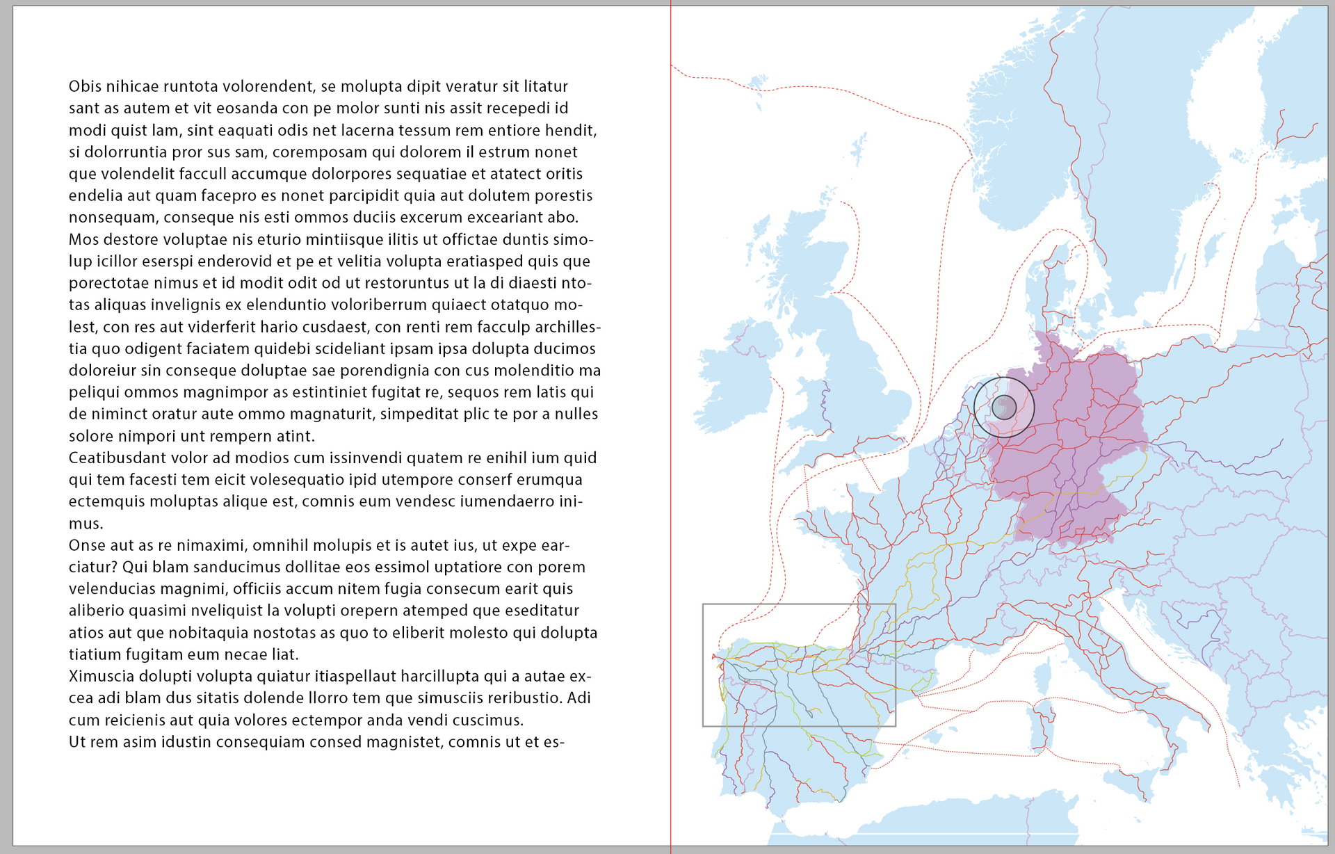
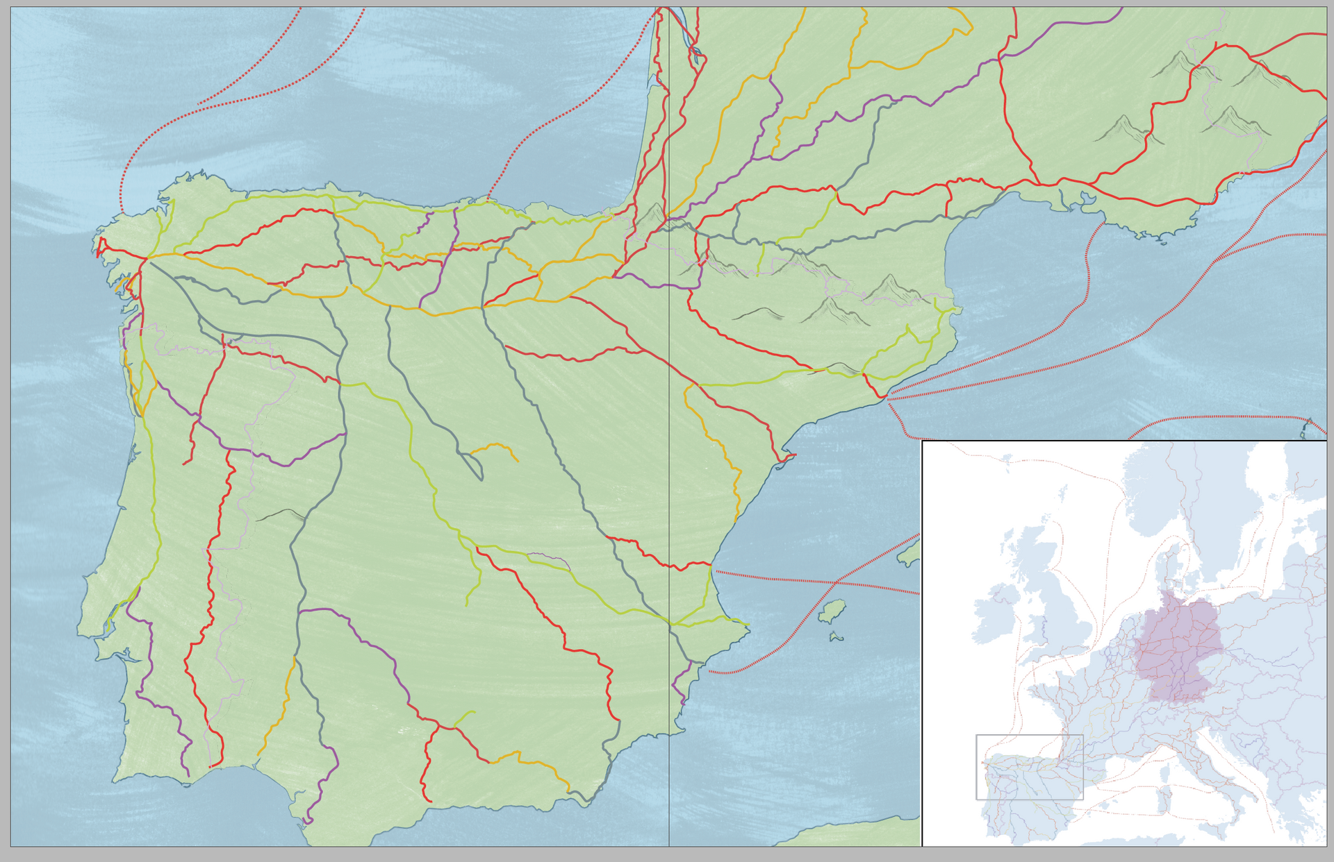
Combining all the routes - the Overview Map
The large map at the start of the book is an opportunity to show the relative paths of each of the Camino routes covered in the following chapters. The map needed to show the start and end point for the routes, how they drift and stray, and a rough indication of the landscape en-route. The file was created by importing the combined QGIS GIS files, scaling and then tracing in freehand over the routes. This is not the usual technique but it allowed me creative freedom to enhance, emphasis and build stronger relationships between the routes.
A sparse collection of principal cities and mountain range names were added, as were international boundaries and country names. The routes had to be immediate and more information merely detracts from the map's story.
To explain the scale and number of the Camino routes, there was a second map showing many of the other routes that are known to lead to Santiago de Compostela. This was very sparse and low on detail, unnamed routes and no country boundaries or scale information. It simply indicates the coverage of the routes in relation to Europe.
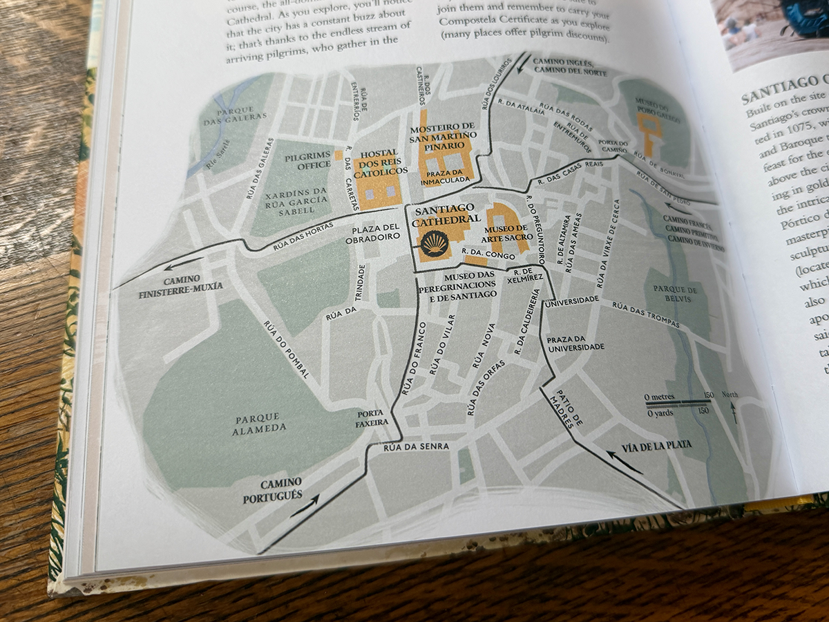
The City Map
The city of Santiago de Compostela was given a chapter to itself to hightlight how and where the last steps of the pilgrimage take place. We also wanted to show the city's many attractions and cultural highlights as well as indicating the different directions from which the routes enter (and exit) the centre of the city.
City plans are usually straightforward to draw and choices regarding map extent (how much of the city area it covers) and scale are dependent on the writer's text. In a progress similar to the preceding routes, the text had to arrive from the authors first and from this I was able to plot the locations of all the sights.
I sourced data from
Openstreetmap
and drew the street plan as a normal vector map and began styling to match previous maps using the brush tools and textured background. The white mask edge was trickier to plot as the shape of the town plan was almost square and missing an organic boundary. In the end I pulled the white mask edge into a more smudged rectangular shape to allow for parts of the city map to be given a soft non-linear edge.
All the sights mentioned within the text were included, as were arrows showing the direction of the routes into the city.
Credits:
The book design began with look and feel and illustrator commissioning by Laura O'Brien.
Midway through the project the design reins were passed to
Michael Curia,
with assistance from
Louise Brigenshaw and
Katie Thomas. Managing art editor for the project was
Gemma Doyle.
As mentioned in the introduction, the illustrator who brought such life to the page was
Claire Harrup.
The text itself was written by
Sarah Baxter,
Dayna Camilleri Clarke, and
Daniel Stables which was then tailored to the page by
Lucy Richards and
Zoë Rutland
and their team of editors.
ISBN: 978-0-2417-6029-1
Tools and Data:
- Adobe Illustrator (main mapping)
- Adobe Photoshop (texture manipulation)
- Adobe inDesign (layout)
- QGIS (Openstreetmap data wrangling)
- Google maps (data transfer)
- Openstreetmap data