Route 66: How We Made the Maps
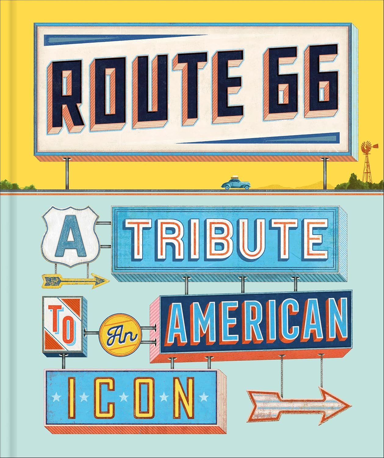
One of the world’s most celebrated journeys, Route 66 has been capturing the hearts and imagination of millions since its inauguration in 1926. To commemorate the road's centenary the travel publishing team at DK produced a gorgeous book dedicated to the adventure of the Mother Road, focusing on all that is iconic and unique about the epic journey from Chicago to the Pacific.
Searching for the Book
It’s a hard slog to publish any new book these days, the planets have to perfectly align and ideally its subject should be high in the public’s awareness. The route’s 100th birthday was already being discussed a year or so ahead of 2026, and as the publisher had no dedicated book to the route, it was given a green light.
The editors and authors built the book’s focus and structure before they opened a discussion with the design team to create its appearance. It was then my responsibility as part of the team to plan and build the essential cartographic elements. You can’t have a book about this route without showing it.
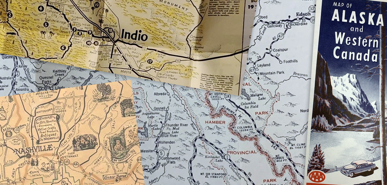
Thoughts of old AAA and Rand McNally sheet maps that would have been integral to any US road trip came to mind, alongside the countless free promotional maps handed out at diners and hotels, all thumbed, annotated and road worn.
A week or so later the design team produced a mood board to suggest an aesthetic direction for the title. I was delighted that the sun-faded sides of old diners, bleached neon signs and mid-century illustration matched my initial thoughts on the project. Bold cracked fonts and distorted textures echoed the long and road weary narrative. A perfect launching point for interesting cartography.
Once the design team had a direction I created a map mood board to share my initial cartographic directions.
Mood boards are a really useful tool to explain an aesthetic direction in a shorthand way which designers are familiar with. The map mood boards are usually created as an answer to those created by the design team. Sometimes, if calendars matched, we could combine to produce a single document to send around to the team but this was unfortunately rare in an office with ten or more urgent titles in progress at any one time.
The map mood board was a gathering of pre-existing maps (the
Rands' and
AAA) as well as some of the maps in books we had already produced in house. Symbology suggestions and font variants were also included but until the final font choices are made and locked into the inDesign templates there is no huge progression. Mood boards are a tool to explain the purpose and rough appearance of the map elements and as such I leave it as open to discussion as possible. Designers like to contribute to cartographic appearances and if I am able to subtly lead the team toward an outcome that works then all the better. Explaining decisions early on in any project avoids confusion or conflict in vision at a later, more critical, stage.
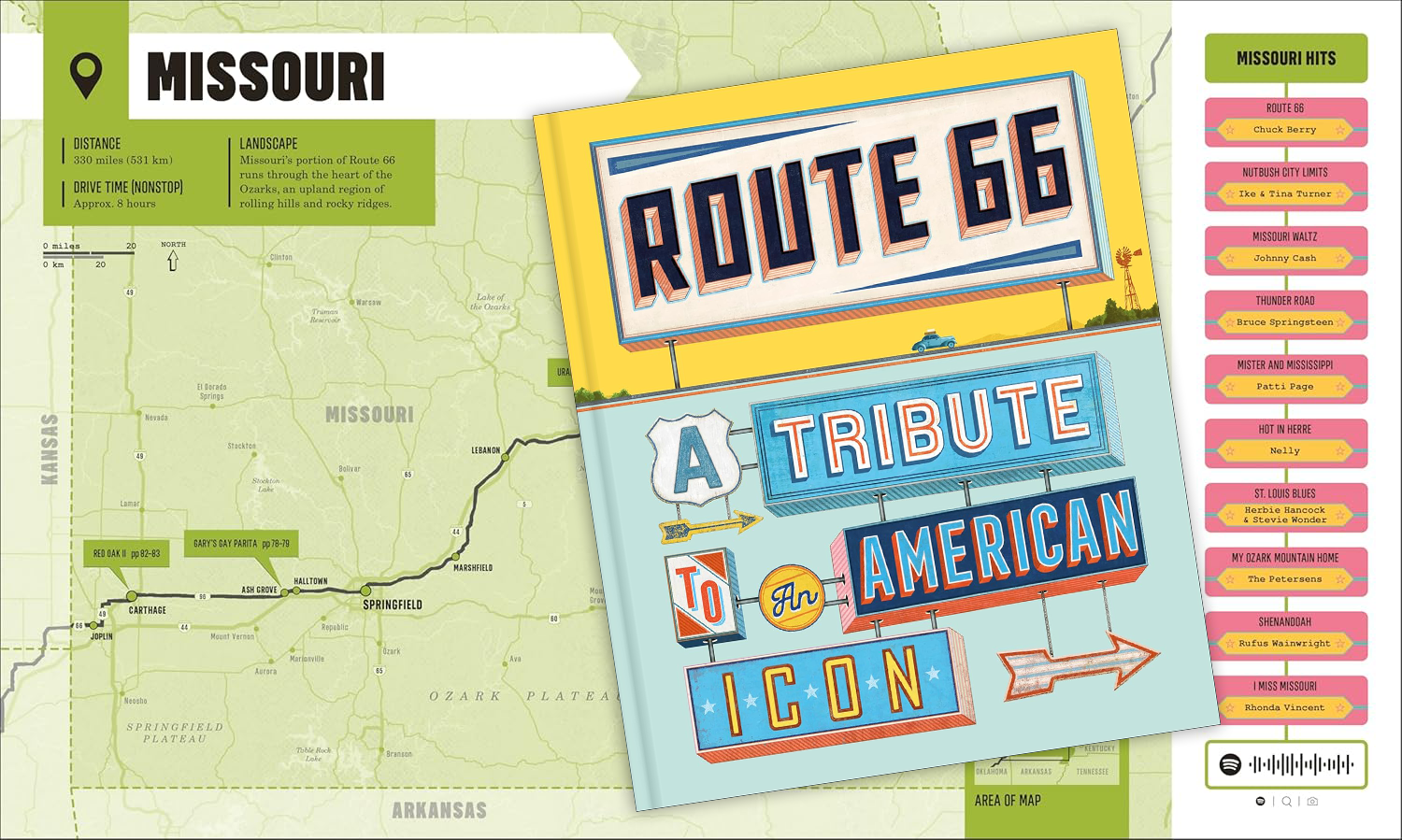
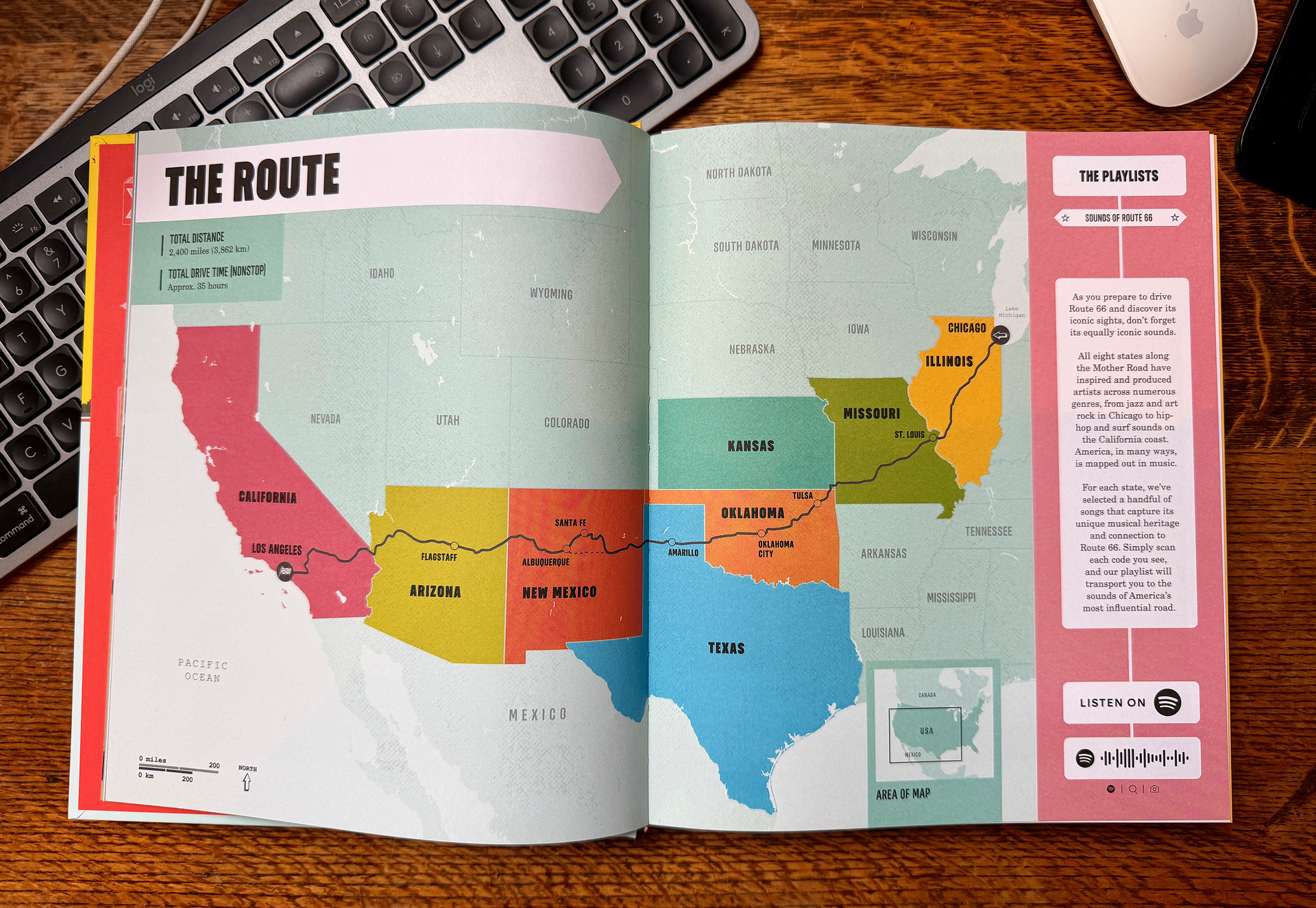
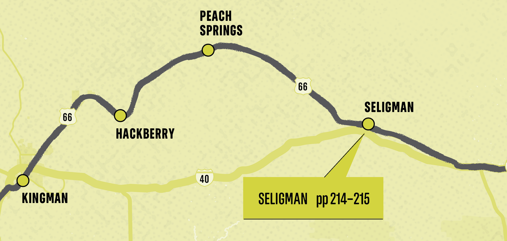
By this point it had been decided that the book was to be an inspirational overview of the route with each of the long, beautifully illustrated chapters dedicated to a different state as the reader progressed west. I would be allocated a page spread near the start of each chapter to show the shape of the route from the point it entered the state to when it left. This was the bulk of the cartographic work.
There would also be a route overview map at the start of the book to show the full extent of the route in relation to the entire lower 48 states.
It’s a matter of orientation
The nature of the journey meant the route would be travelling in almost a horizontal line across the states as it travels west. The only complications being Illinois where it heads more south west and Kansas which is a tiny dogleg into the far south east of the state. The maps would cover each state with the route progressing from east to west. To ensure the reader sees the direction of travel we would need to include arrows to the route.
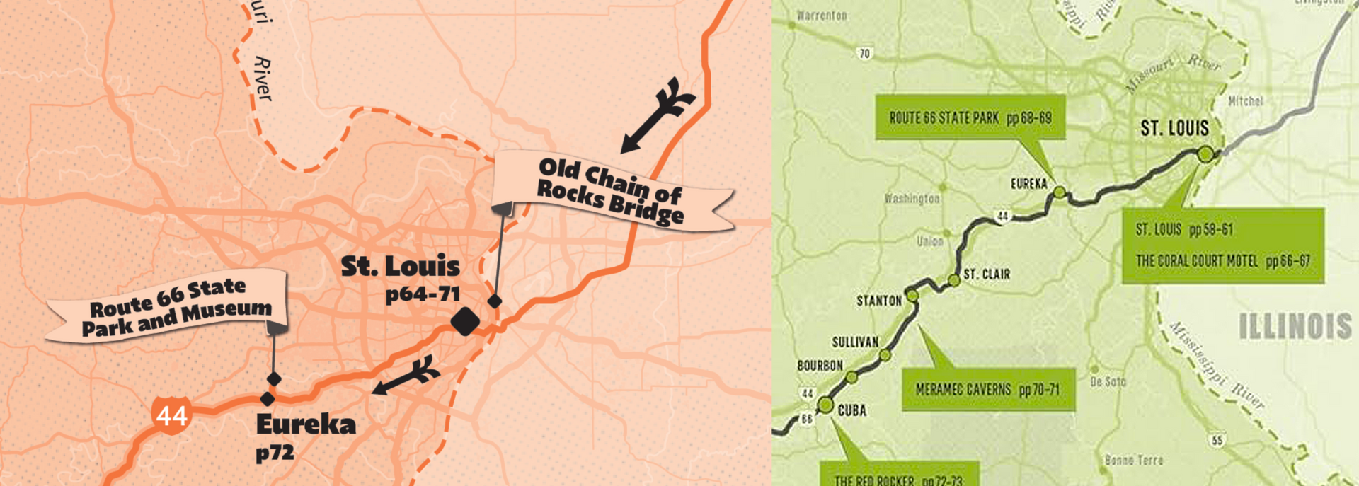
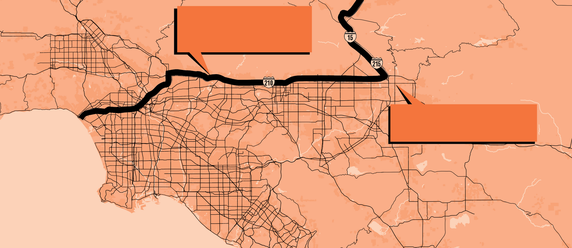
Due to the route crossing the page in such a narrow band there was enough empty space available on the page spread that I had initial thoughts of including small city maps. These would have been for the main hubs of Chicago, Los Angeles, St Louis and Albuquerque but as the project continued it became apparent that this was not a practical guide and was not critical to the reader. It also would have taken more time and therefore more cost. Interestingly, the majority of city sights were found on the outskirts and were able to be included on the main map.
Another consideration with the 'empty space' was overfill. Drawing too detailed a map across the whole page would draw the eye away from the route and make a noisy layout. The road needed to be instantly visible, as did the direction of travel. Showing a simple road network, rivers and lakes as well as main towns and park areas was enough.
As we were not including the city maps we had a lot of space to fill. One suggestion was a secondary list of the sights along the route shown with a page reference to assist in cross referencing to pages in the forthcoming chapter. What soon became apparent was the labels on the map were able include these page numbers and any repetition was just filling space.
Later in the project the playlist was able to be added in the available space.
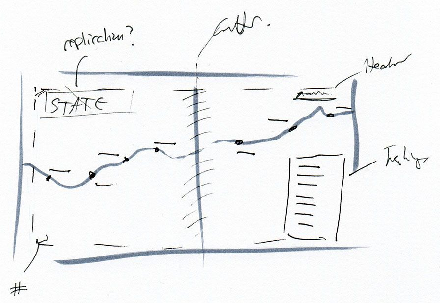
Gutters
The nature of book binding means the gutter (the part of the page which is lost in the middle where the pages meet) is always an issue for cartographers. Although this title's gutter was not as severe as those found in smaller travel guides, we still did not want the map to disappear or hide any important information. Thankfully the sights being highlighted were almost universally distributed away from the centre of each state where the split in the page was crossing.
Once combined with the scale we were using for the majority of the maps it was easy to run the map as a single image across the spread with no need to split.
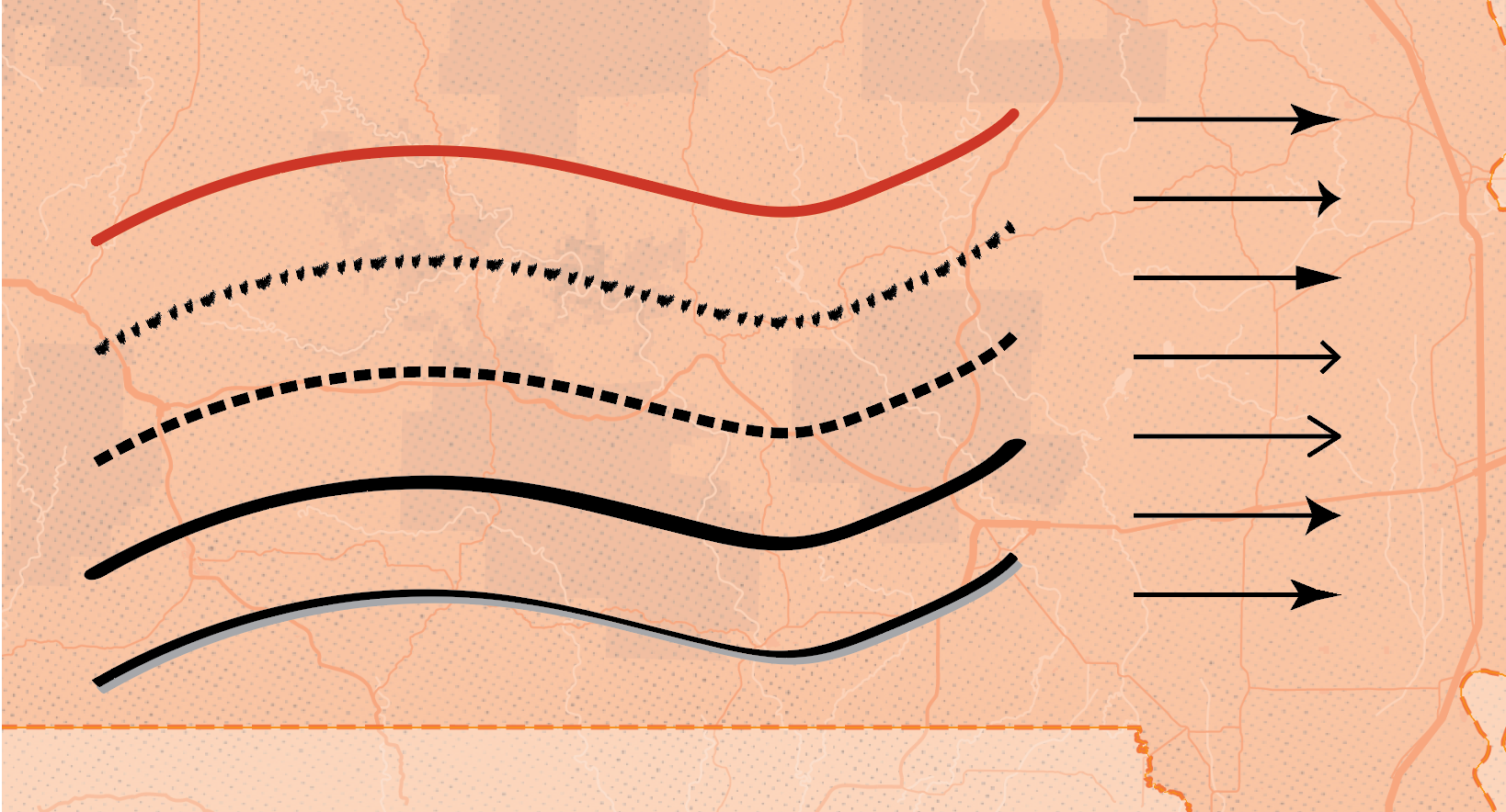
Depicting the route
The route is the heart of the map and needs to be instantly understood when viewing the page. As beautiful as some artistic methods of route representation can be, if you can't immediately make out the progression of the journey they are useless.
I had played with many line styles to see how they would work on the page. Outlining the road, dotted routes, just using arrows and a number of other techniques but nothing was as instant as a single solid line. As each state had been allocated its own colour swatch by the design team the line needed to be a consistent colour as opposed to a complementary or changing colour which could cause confusion.
The chapter colours were also of varying strength so running a plain white or pale route throughout could be tricky to identify on lighter colours. A black line was the clearest style, its strength also meant we could add texture and character without losing any impact.
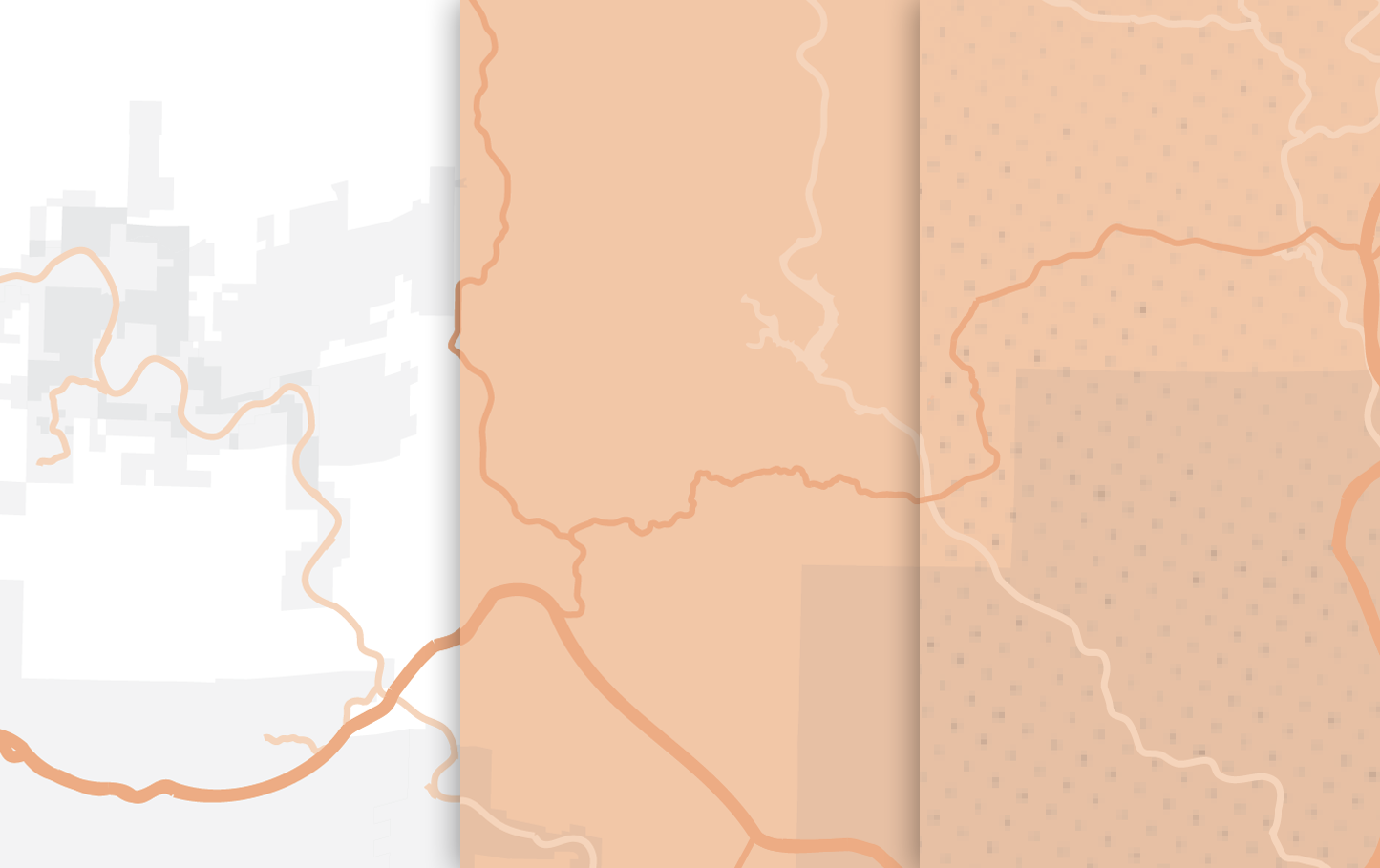
Textures
The design department’s mood boards for the book had many beautiful images of rusted and sun faded roadsigns and the warm welcoming curves of diner counters and petrol station pumps. This needed to be echoed on the maps and the addition of a texture was locked in from an early stage.
I had originally overlayed a temporary dotted and distressed texture which filled empty space on the map and called back to the printed texture of old mass market free sheets.
The line of the route itself was also given a distorted texture, it was too solid and imposing on its own as a wide black line so a duotone style was added. To do this the line was converted from a single stroke to a filled polygon into which textures could be added.
The single line was of course maintained, hidden beneath the other layers in the file, to ensure the map could be adapted and modified if necessary in the future. At points along the route line an additional brush stroke was added to add some organic feel to the depiction of the journey.
Working alongside an illustrator
Earlier in the project while I was building the base for the maps the senior designer had approached the American illustrator Christian Northeast to create the cover, chapter welcoming images, and other small elements through the book. DK are keen to approach creatives located in regions featured in the books for both their authentic local knowledge and also to support local artists.
The maps needed to echo and live alongside these illustrations. We commissioned a new texture directly from the illustrator to replace the original draft texture I had been using to maintain consistency. Unfortunately the returned file didn’t quite work with the maps as the patterns were not arbitrary enough. At the later stages of the project it was more important for Christian to focus on the larger illustrations than resupplying this element so I recreated the original temporary texture at a higher quality through vectorisation and distortion of a dotted grid.
I had also experimented with a parallel line texture to link closely to a theme in the supplied illustrations but it brought too much cartographic representation. It could be mistaken for a depiction of water or highlighted areas such as parks so we stuck with the dotted grid.
This was laid across the map and used a number of transparency styles to ensure it was visible but not obstructive.
Raising flags
Each sight featured within the book needed a distinct and clear label. In an attempt to link across to the road sign motifs regularly occurring in the illustrations and photographs I began with a style based on a road sign.
This became too restrictive as a number of sights were too close together to allow clear labelling. It also would have resulted in a page that was full of monotonous and perhaps overpowering boxes.
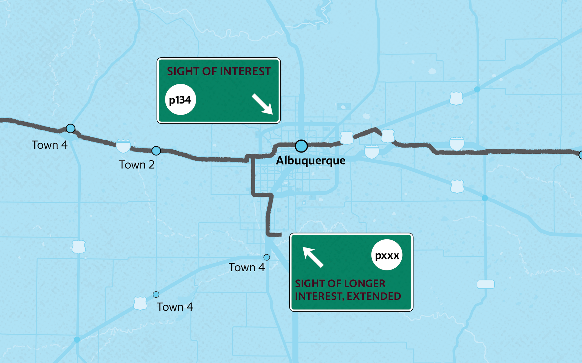
To push forward I looked at using illustrative flags at casual angles holding the names of the sights. It did still link to the illustrations but was a little too playful. It also limited the amount of space for longer names and/or page references. Another issue was it limited the space available to the co-publishers who might wish to translate labels resulting in longer names.
Discussions with the designer relating to typefaces resulted in a simplified box with the action element being an integrated arrow rather than a flag pole. The arrow links to the location precisely and could rotate around the rectangle to aid with placement. With a number of tests to check spacing and styles, the design was finalised and rolled out.
Drawing the maps
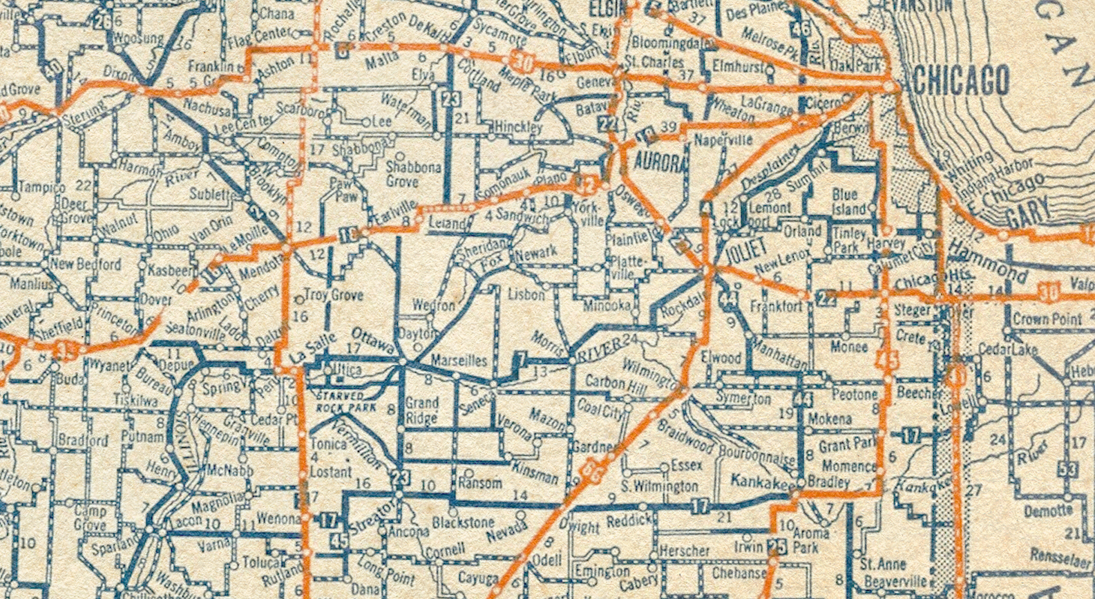
As with most maps produced for travel products at DK, the data source for the maps was Openstreetmap(OSM). The data used is actually quite sparse, with only the road, boundaries, urban area and water used as the we did not want the maps to be too busy. The map files were still cumbersome due to the large area of coverage for each state. California specifically was a challenge as the large number of roads within the Los Angeles area alone meant the map had to be simplified to allow Adobe Illustrator to display and edit the data. The file size would later cause a disruption to the technical checking stages.
Within the OSM data, each carriageway is represented by a line which splits at each interchange. Instead of a single line running through Los Angeles to show a road, the initial data used hundreds of separate elements.
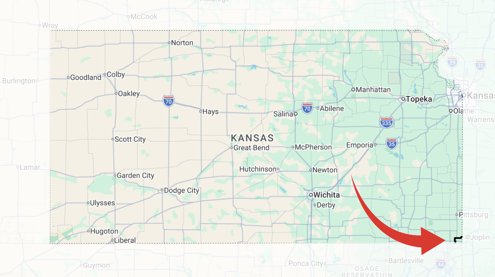
Tiny Kansas
Kansas
was an interesting anomaly within the book as the route only dips into the lower southeast corner of the state for a few miles. Building a chapter around relatively few entries was a challenge for the authors as well as cartographers. Thankfully there were enough interesting sights in this small segment of the route to fill a number of spreads and with a couple of large full page images it did not feel so restricted.
Cartographically it was a different matter. I was not going to be able to show the entire of
Kansas
and the shape of the route was the more vertical than horizontal. We experimented with a single page map instead of the usual double page but it looked unbalanced. The small area of the state was enlarged and we pulled the majority of the route onto the left hand page.
One of the styles we integrated into the maps was to include an opaque fill over areas that were not in the state in the chapter. This allows the route to continue and elements be visible in the following state for reference. For
Kansas this opaque area was much larger than on other maps. To ensure consistency the depth of the transparency was lightened across all maps to ensure the map was pleasing to view.
Songs for the Road
Late in the project I was tasked with building a playlist to accompany the reader along their journey. This was a brilliant responsibility to be handed as I have always been incredibly passionate about discovering and sharing new (and old) music.
I have dedicated a
separate article about this task.
The Importance of Checks
As the project progressed there were occasional changes to the entries when the text was edited and flowed into the inDesign files. These changes needed to be included on the maps. Another part of the process from a cartographic / spatial assessment was to ensure all imagery used was correct and current. This caught a few small image changes such as the recent relocation of the Gemini Giant which meant an image replacement was needed to be found. All the images which had a location mentioned in the caption or content would be checked. I would also check urban landscape images as these change at a rapid rate, the loss or addition of tall buildings is a common occurance and can date images. This has always been done for every project I have worked on.
One of the most critical parts of the project from a cartographic perspective is the checking stage. I passed all maps through the Delhi based cartographic team then through editorial and design teams. This is really important as map makers do risk checking a map cartographically rather than editorially so other team members can catch things we had passed or were awaiting confirmation of, the more eyes the better.
Once we approach the end of the project the map files are fed through an automated checking system to ensure all technical and structural elements of the files are as they should be to print correctly. The files in this book were so large that it would cause the checking program to crash. Files could take up to an hour to run through the system. With a book that had so many maps, the importance of keeping ahead of the deadlines was critical.
Once the files have been checked by the automated system they are combined with the rest of the digital files and checked again internally by a print specialist before being sent to the printers. We are then just waiting for a final proof from the printers to check before final approval. At this point it is disruptive and expensive to change so any amendments have to be essential. The misspelling of a small element unrelated to the route should have been picked up by the 5 or so check stages but will be left to be corrected at next edition at this point as the error makes no impact on the reader's use of th book.
We then wait for the first few copies of the book to be shipped by air to the office. The main book order is packed and sent to the distributors as required before being shipped to the retailers.
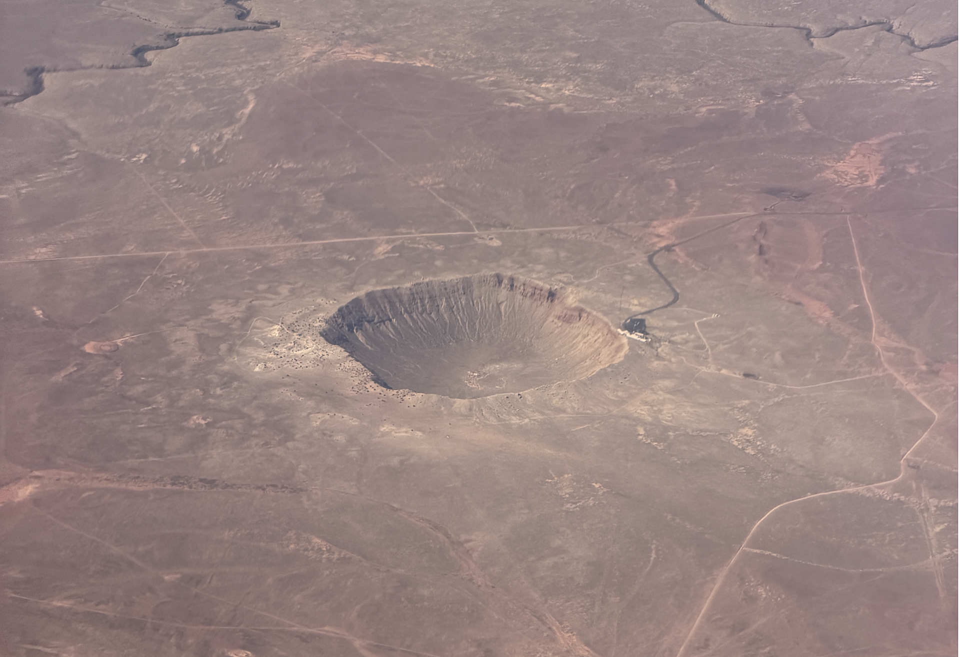
Tracking the Route from the Air
A few months later I was in the fortunate position of tracing Route 66 from the air from Illinois to Arizona. It was fascinating to follow the road as it headed west, knowing the history and stops we had included in the book. Recognising what city was coming next and waiting with excitement to see the Meteor Crater National Landmark toward the end of the journey - but this experience was the route without the journey.
It just left me eager to get behind the wheel and head west through rather than over the epic landscapes. To track the history and people as well as the deserts, mountains and forests.
Credits
The Senior Editor,
Lucy Richards, with her team
Lucy Sara-Kelly,
Tijana Todorinovic,
Catrina Conway took constant and detailed care of the book's content and were all more than able to help me with a slew of content based questions and comments.
Recent addition to the DK Travel department,
Michael Curia as the senior designer was a beacon of enthusiastic inspiration throughout the project and was a joy to work with. Having a thousand ideas and welcoming everyone's suggestions. The design work itself was pulled to order by
Bess Daley with picture research by
Claire Guest.
As previously mentioned, the illustrator
Christian Northeast
was a keystone to the look and feel for the book and it was great to have this artist's work to align with even before the final illustrations were provided.
ISBN: 978-0-2417-8474-7
Tools and Data:
- Adobe Illustrator (main mapping)
- Adobe Photoshop (texture experiments)
- QGIS (openstreetmap data wrangling)
- Google maps (data transfer)
- Google Docs - Playlist cataloging
- Spotify - Playlist building
- Openstreetmap data