Mapping Taylor Swift's London
Every year or so there is a travel department workshop to brainstorm unique new titles. There are usually some amazing ideas amongst the repeating title suggestions (many of which clearly should have been published years ago), this one however was a treat.
What is trending? Well, in the late summer of 2024 you couldn't move for
Taylor Swift, her
Eras Tour was hitting the UK hard and one of the editors, Sarah Allen, (a strong contender as the office go-to for all things
Taylor),
put forward the idea for a small gift book about the singer and her connections with London.
The initial department enthusiasm was matched by the senior teams, and then, most critically, by the marketing team. It was assessed, costed and approved, meaning Sarah could take the reins.
When dealing with popular culture there is a demanding schedule. It takes months to create a book, months to print and ship from the printers (in China for this title) and then weeks to distribute for publication. To catch the trending wave this book needed to be sent to print in record time, something larger publishers sometimes struggle with. Despite this urgency, there is always a slight delay while things start gearing up and it was not until a week or so later that I was brought in after it was confirmed the book needed to have maps.
✶
The initial discussion around the book had been simple enough, a 'nice map' which showed all the relevant Taylor Swift sights. As the project moved on it was up in the air if there was to be a geographical sub-division which would all need their own area maps, and would there be a further afield map? The answer to all these questions depended on the locations being selected.
While the sights were being researched I awaited the first moodboards from the design team that would give direction to the title. I created a personal mood board and tried to bring the idea of sketched, distressed linework to these maps. I wanted to link the cartography to old fanzines, autograph books and joy filled teenage fanaticism. As much as I would love to have created the whole thing using a Sharpie and a Xerox machine to echo the punk zines such as Punk Planet and Maximum RockNRoll, it really was the wrong audience.

The design team's moodboard was clearly playful but also quite clean. The maps would need to follow this feel and I sought a playful solution. When working on characterful maps there are strong structural anchor points to work around. The maps must still be clear and legible (including to colour blind readers), adaptable and scalable and able to be revisited by other teams at later stages meaning they have to be vector files drawn in Illustrator.
I gathered some examples of map styles which I brought to the team to discuss direction; a mini-moodboard.

While this was happening, the team began assembling the sights to be included which was an epic task in itself. Despite my lack of Taylor Swift knowledge, I was able to contribute a few sights. Abbey Road Studios, St Pancras Hotel and a couple more, had already been part of a book I had worked toward which never came to fruition - the Music Traveller's Guide. The locations had to be accessible, visible from public land and not private residences. The responsibilities of a publisher in this regard are huge.
Another issue to take into account was the infringement of trademarks and copyright. This was to be an unofficial book and, as well as making it clear on the cover, we needed to run the pages past the legal department to ensure we had not strayed into actionable territory. Taylor Swift is rightly protective of her privacy and at the time was subject to her private jets being tracked and the usual paparazzi attention, meaning extra care was needed.
Once all the sights were confirmed, I placed their geocodes into
QGIS (GIS software) along with
Openstreetmap
data to get an idea of the density of the sights. If they were too closely clustered it may have been that the map would have had to be split or divided up. Thankfully there was a good distance between each.

The decision was made to abandon an alphabetical listing and build the book spatially, there were to be six different areas, each needing a map and an overview map showing all the sights relative to the entire city.
The book's map list
- Overview Map of London
- Central London
- North London
- East London
- South London
- West London
- Beyond London
✶
Creating Taylor Swift Walks
It was during an early progress meeting that it was suggested that there would be themed walks. The marketing team felt this would be a good sales point so there were 5 additional maps to be drawn. These soon became full spread feature maps, meaning the simple sketched idea I had would look very empty. The Beyond London chapter would not have a walk or drive as the sights were too scattered.
The editor had selected which of the Taylor related sights to include on the walks and I began building the routes. This meant selecting a starting point and an endpoint, usually a specifically linked restaurant or bar. The routes needed to be safe, easy and ideally accessible and, although not a step-by-step guide, the routes did need to depict the exact roads or paths to travel on.
I had briefly looked at including quick, line-drawn illustrated buildings to the maps but a lot of the sights were not instantly recognisable and the maps would have just become noisy with many shop fronts. It also meant in busier areas we would be restricted to what we could show due to a lack of space. The usual cartographic tool of the building footprint was used, simple and effective
I then began looking at hand script for the fonts, to pull in the handmade feel, as though the reader was sketching their way around the city. I actually pulled together an example to show to the design team. We agreed that it was conflicting with the cleaner feel of the text which was still being worked on but was more likely to be a sans serif type.

The route was also liable to be lost when thin and brushed as in the example above, and the yellow tinted road edges risked clashing in low light and a little too close for red-green colour blind readers. The text for the roads was also being lost in the hand script which meant a rethink.
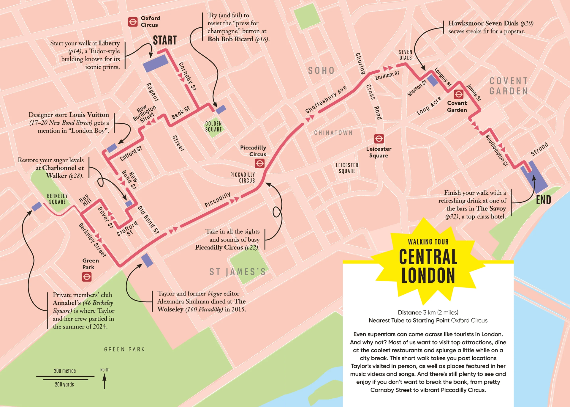
The other choice that went against the usual DK style was to show the road names in title case rather than all upper case, portraying a softer appearance. The reason the road text is usually shown in upper case on city maps is due to size restrictions. Some guidebook maps are tiny with little room available for their maps. The smaller the maps then the more the road labels are severely compressed; the capitalisation helps legibility. The copious space available in these books meant this was not a problem.
I had left draft arrows on the map with a route and sights as a bare canvas to allow the design team to work in the annotated elements to echo the rest of the book. These eventually became very simple meandering arrows. They needed to be solid and tinted to match text to avoid any conflict with the coloured route line. Building them as 100% black and on overprint setting meant that if changes needed to be made for translated editions the arrows could be shortened, lengthened or replaced entirely.

To pull the feel of the maps more toward my fanzine style idea, I began duplicating road casing (the lines that make up the road) and placing behind the other road linework - to give a slightly misaligned and rushed feel. It gave a link to the ideas and aesthetic of the fanzines I had looked at earlier in the project while maintaining a precision. The centre of the roads were filled with a white tint that was then given a transparency to add a ghosted fill to the highways and paths. The roads which ran through parks had to be punched through the green area to enable the same style to be maintained.
The underground stations needed labelling as did city areas and parks. The decision was to label only elements relevant to the area or Taylor Swift. The more content on the map then the less inviting and less legible it would become.
✶
From the beginning of the project the design team were very keen to include illustrations across the book, these were initially to be integrated into the maps. These began to be fed through from the illustrator Jordan Andrew Carter and we pulled them across the pages. They made a strong showing on the cover alongside the illustrated portrait and also gridded on the endpapers.
The pigeon became a department favourite.

Gutters
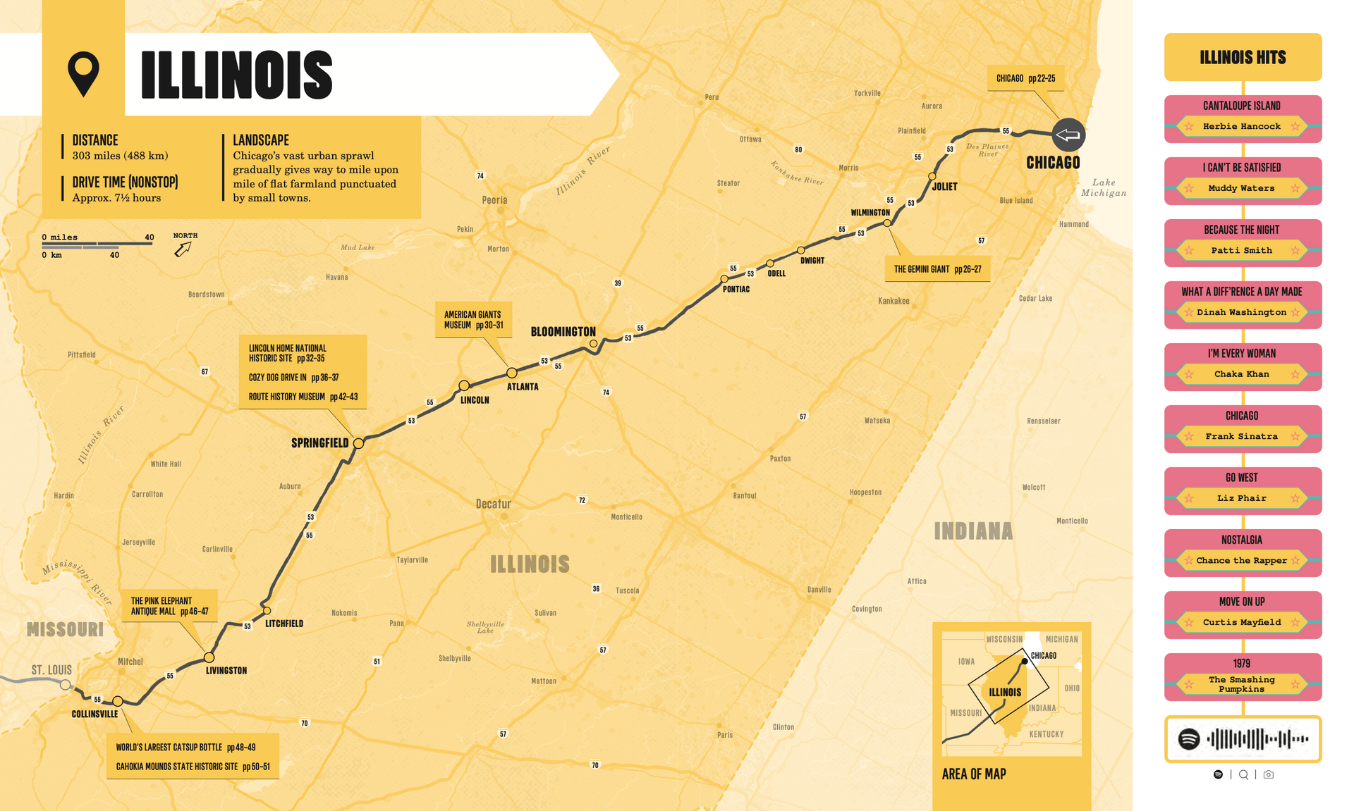
One technical issue with books of this size and binding is the page gutter is very deep, this is the area where the paper meets at the spine, compressing in the middle so that any printed content is not visible. For maps that cover the whole double page this is always something to take into consideration; how much of the map is not able to be read. We like to avoid readers breaking the spine of a book to see the content there so we approach the problem in a couple of ways, either boxing the map into two and having the map pause between the gutter or running the map across with extended detail to fill the space. Occasionally the gods of the mapping are in our favour and the binding and map content means we can almost ignore the gutter - see the maps for Route 66.
To let this book's maps work, I boxed the content and gave a 5mm space either side of the central gutter. This results in the maps appearing seamless but actually, if you break the spine and look, there is space. Unfortunately this does mean the PDF which is created by the ebooks team can sometimes still have this break in the maps. Ideally the map image should be replaced with a full map but in the epub files for this title the map is still split.

When Things Change
Of course, producing a guide such as this only takes account of events and locations before the book goes to print. Since the book has been on the shelves there are plenty more locations which would have been included, the Whitgift Centre in Croydon for instance was used as the location for the Opalite video. Just more content for the second edition.
Other Artists and other Cities?!
There have been fan made guides to cities for decades, the
Beatles had fans drawing maps of both
London and
Liverpool since the
1970s, but these usually only work well if the story of the artist is deeply embedded with a location. A specific scene emerging from a small location is great, for example, the grunge movement from the
Pacific Northwest
(despite the music actually being varied) or cities with huge diverse musical history (Detroit,
Strasburg,
Manchester).
Upon the release of the Taylor in London book the comments section on the Amazon reviews (yes, the publishers do read these!) was full of requests, Oasis being notable due to the media's focus on their reformation in 2025.
Fan's access to mapping tools such as
Google Maps
means it's incredibly simple to create an online map detailing locations. Unfortunately it is all to easy for these to be shared with locations that are still 'active', the last thing a notable musician needs is their house or office locations known to the world. Obviously the keener fans will always find a way.
Some map based music recommendations,
Herb Lester produce a great selection of themed maps:
- Fear City - NYC Underground 1974-1981
- Situation Vacant: The Sex Pistol's London
- Rolling Stones London
- David Bowie's London
- Metal Mappa Mundi
- Bob Dylan's New York Revisited 1961-69
Some others
Rock 'n' Roll London: A Guide to the City's Musical Heritage
London's Lost Music Venues
Music London
The Beatles in London Walk
For some metro-style diagrammatic maps,
Mike Bell has produced a wide variety covering many artist's timelines.

Credits:
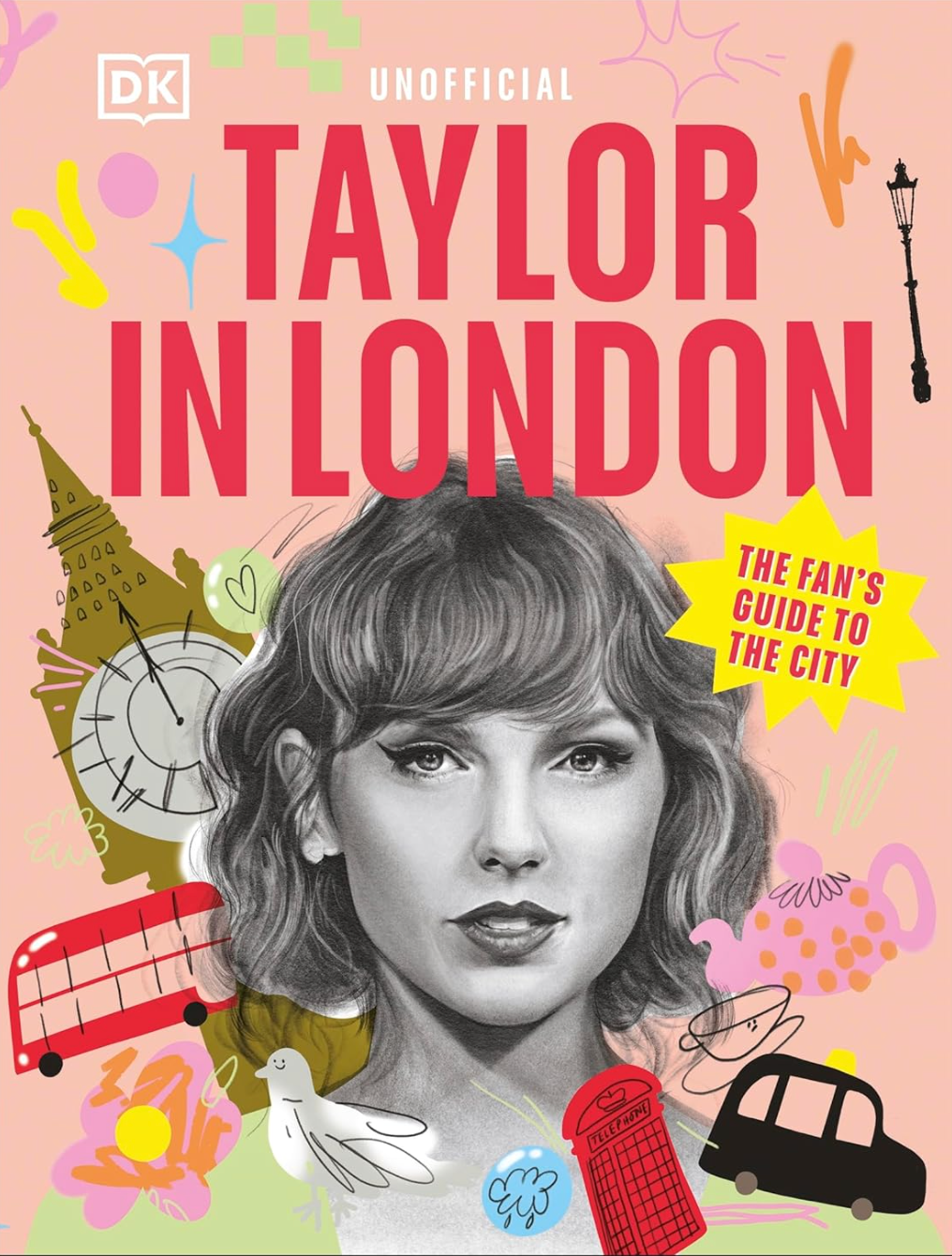
Every book has a unique heart and it's the people who work so hard on it that create that spark of joy. Hopefully you can feel the passion and effort that was placed in the project but it's its architect and editor Sarah Allen who is responsible for the book. The design was built by the managing art editor Gemma Doyle (who also designed the stunning cover) and placed on the page by Kei Ishimaru.
ISBN: 9780241774397
Tools and Data:
- Adobe Illustrator (main mapping)
- Adobe Photoshop (texture experiments)
- QGIS (openstreetmap data wrangling)
- Google maps (data transfer)
- Openstreetmap data