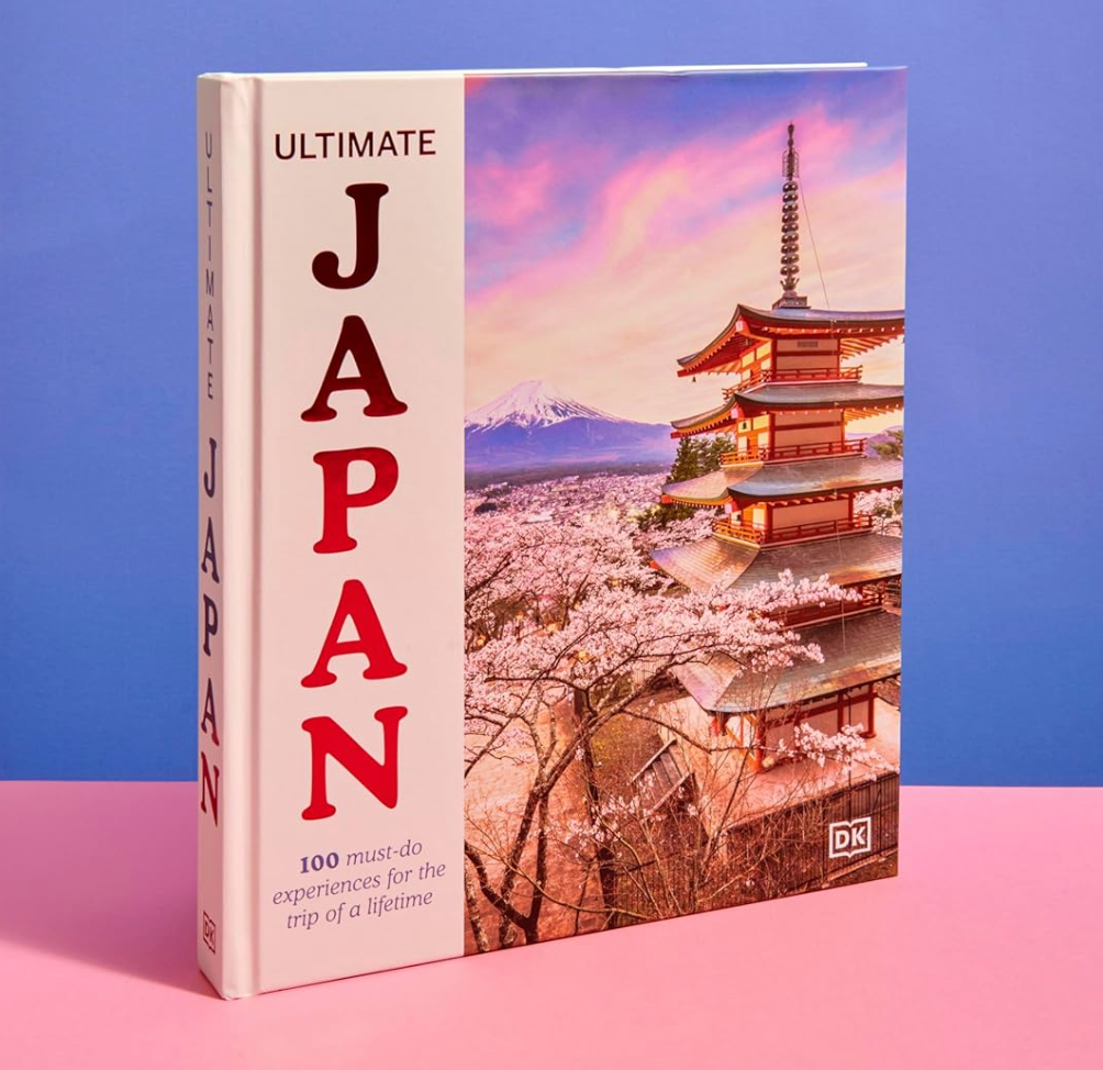
100 must-do experience for the trip of a lifetime
Japan is a best selling destination for all travel guide series, resulting in publishers continuously searching to create a new angle to explore the country. I have worked on twenty five different Japan titles and counting and doubt there will be a slowing going forward.
DK
had already published the iconic
Be More Japan back in 2019, just in time for the Coronavirus lockdowns which all but ended international travel for years (the second edition of the book was released in 2024). They wanted a larger format title written for a more universal, popular view of the country. Having already secured an author (the brilliant
Rebecca Hallett) and support from the marketing department and co-publishers, the book began to take shape.
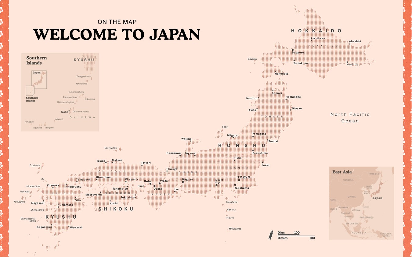
For the map elements in the book I wanted to move in a different direction to the maps drawn for previous Japan titles.
The proposed structure of the book needed a national overview map at the start of each chapter covering themed sights. This meant the repetition of the same map throughout the book and, if we were to use a traditional topographic map, it would probably become overlooked after the second chapter. I decided to explore a more unusual way of sharing the information with the reader.
Breaking away from The Map
A common cartographic technique used to show a variation in data value is a scaled symbol grid (or proportional symbol map). This is where a repeating icon changes its size depending on a value. Its placement shows location and the size or colour shows a relative difference.
A good example can be found here showing drought levels by John Nelson.
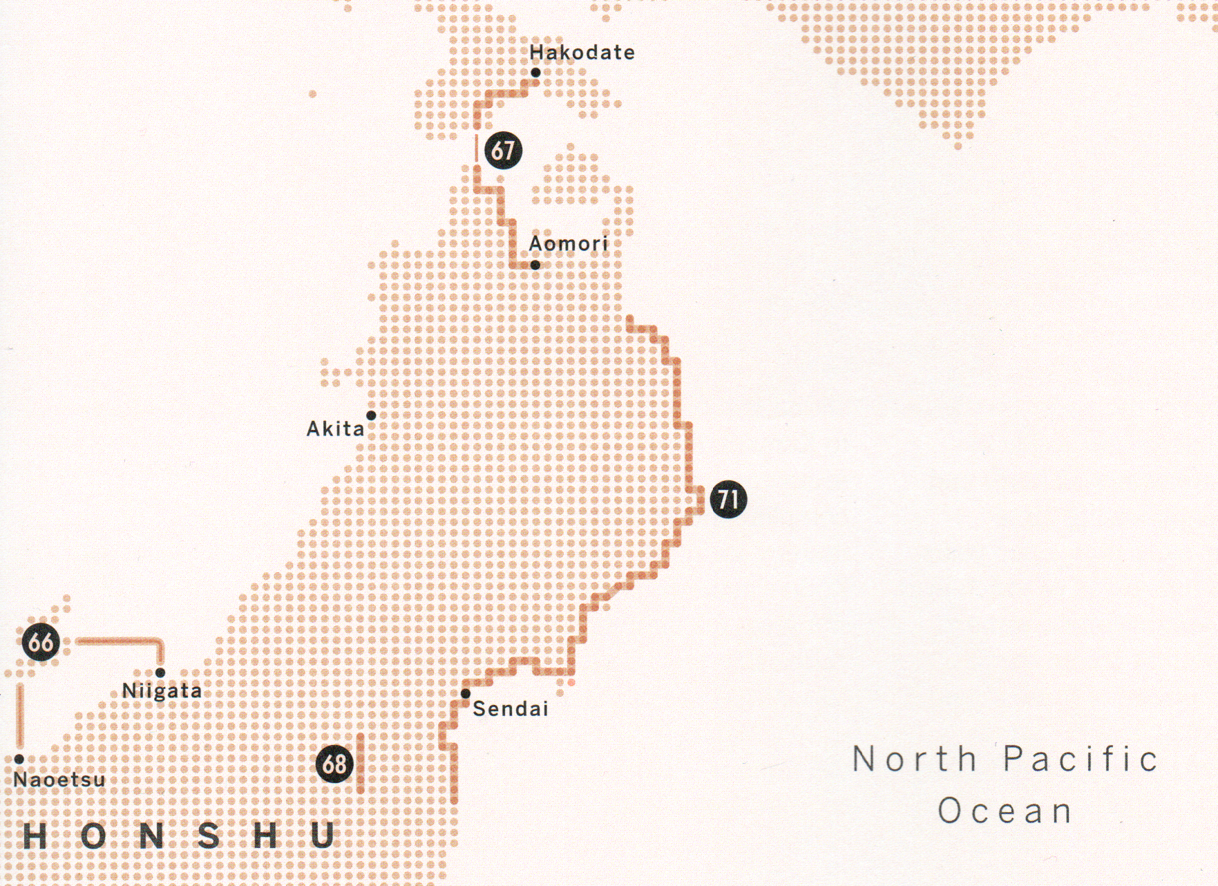
I had always liked the elegant simplicity of this map form and had hoped to use this at some point in a guidebook. As the only data being shown was location it limited the need to alter the symbol size so why not have a sheet of symbols just depicting the land shape? The idea was strengthened when initial design plans produced by the design team included a number of red dotted lines across the page. I decided to take the dots and build the map solely from this shape. It also helped that the colour of these dots was red, a link to the flag of Japan, itself a dot in a white space.
Keep it as clear, clean and basic as possible.
I began experimenting and immediately the size of the symbol was critically important as even small changes to the spaces between the dots would affect the level of generalisation (simplification) I was already having to juggle with. How much can you simplify the shape of the country and retain its familiarity?
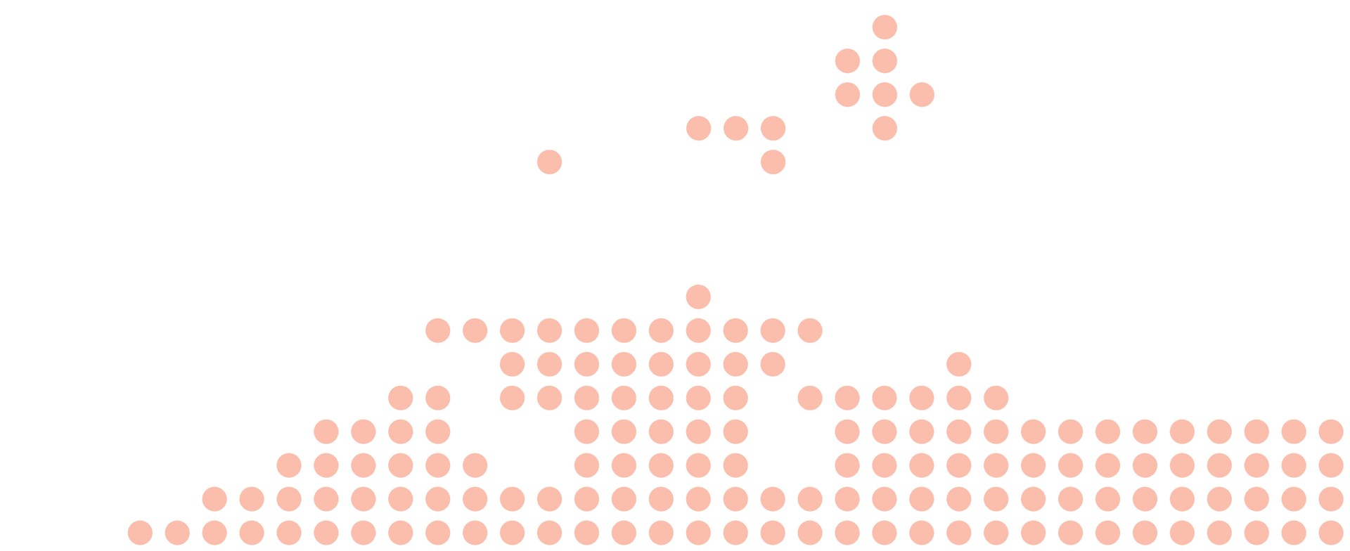
I created four different maps with four different widths of dot and printed these to test the appearance at arms length, up close and in low light. Although not a reliable full printer proof, these test prints are always important at the initial stages.
The next challenge was to work with the design team to make sure the colours selected for each of the chapters would translate to the dots. Consistency is important and the same strength of the colour swatch should try to be integrated within the maps. Fortunately this showed all tints would work fine, even when used in the dot form. If there was an issue with the colours not working, I would have been able to work with the design lead to adapt the chapter colours to suit the maps.
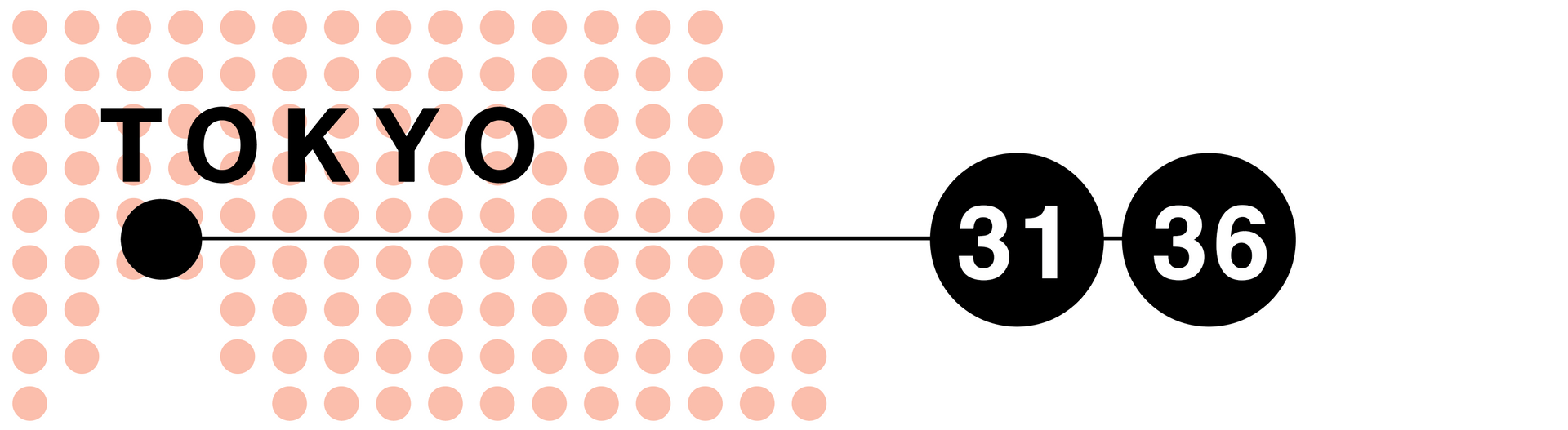
I began styling the labels and symbols on the maps to be as sympathetic to the aesthetic as possible yet still be instantly readable. The obvious option was to tint the specific circles which would represent a city location black and then label as needed. This was tested and worked great with all colours and maps.
The editorial team had introduced a numbering scheme to the sights meaning the reference numbers (called bullets by the carto team) were to be another circular motif that continued the dot style. The circular dot numbers have been a staple of the DK map design for decades meaning we could just reuse the existing custom typeface. The co-publishers all have access to this typeface so any changes to the text's order within a chapter could be updated on the maps by their own teams.
I had tried assembling the dots around the locations in cases of shared location but this just added uncertainty so it fell back to the use of a leader line pulling the dot to empty sea areas.
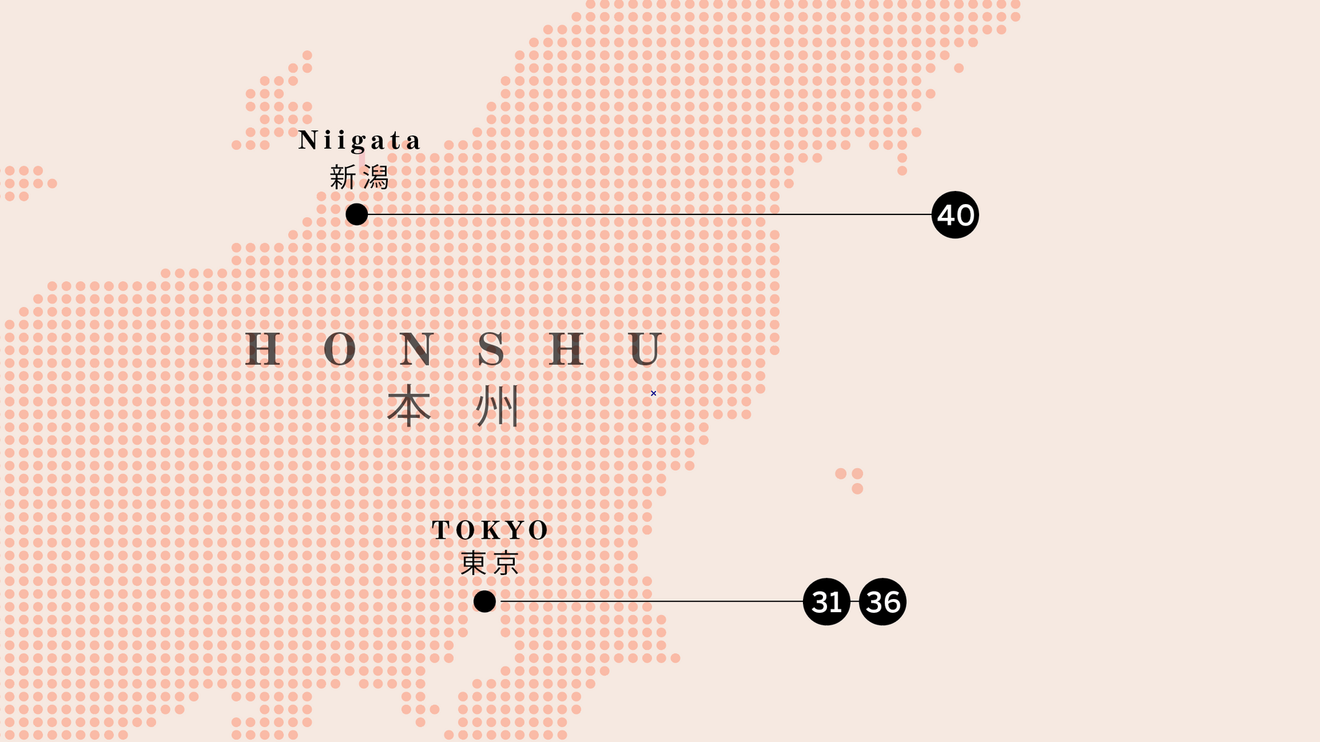
Japanese script?
One option when mapping Japan is to add the Japanese names to the map alongside the translated names. This can be especially useful when using the maps for navigation on the ground. This book was an inspirational rather than practical guide which meant it was not as critical.
Initial tests did include the Kanji text for major cities as it brought an interesting aesthetic but the detail conflicted with the simplicity of the dots so I dropped them. It also meant another checking stage by an editor fluent in Japanese, another cost.
Mapping the tours chapter
The Journeys in Japan chapter was a collection of curated tours criss-crossing the country with the chapter opener map style being slightly adapted to depict the routes in the text. I began testing different ideas such as a solid line for each route on the map, just showing the routes as the dots on an outlined map and another selection of possibilities which all had issues.
The simple black solid line option felt sterile and was working against the aesthetic of the map. In the end it was simple, we just highlighted the existing dots which would be found on the route and shaded these with more strength and included a subtle shadowing to boost the visibility. This would not have worked if the routes had been too closely aligned or too intricate.
Chapter route maps
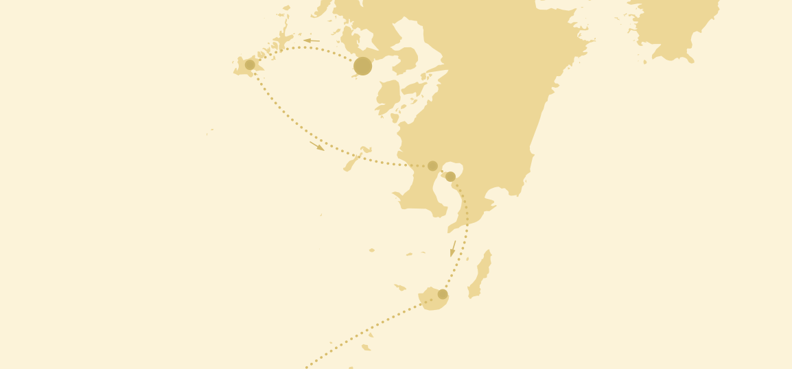
At the close of each chapter we commissioned a themed tour to join together the sights mentioned over the previous pages. These tours were more visually complex with routes occasionally revisiting locations and requiring an indication of direction, as a result the dotted mapping would not work as a clear base map. To build the page the maps were pulled back to the most basic forms we were happy to work with; a coastline, the cities and a progress line. The simpler the map then the easier for other editorial and design elements to be added. The style of the chapter opener maps was echoed by the route line being formed of dots.
The boxed detail - to inset or to not inset
As a cartographic element, insets are usually only used when it helps reveal the subject of the map more clearly. A detailed focus area such as a city centre for example, or if the scale of the map means elements further afield are outside the map area. The main map should be scaled to show the relevant content as clearly as possible, ensuring that nearby reference points are present to enable an instant understanding of place.
Sometimes elements need to be shown that are more distant which would result in the map being too crowded in one critical area and too empty elsewhere, this is when an inset to show more distant sights can be used. The main map should still cover the main area with as much clarity as possible.
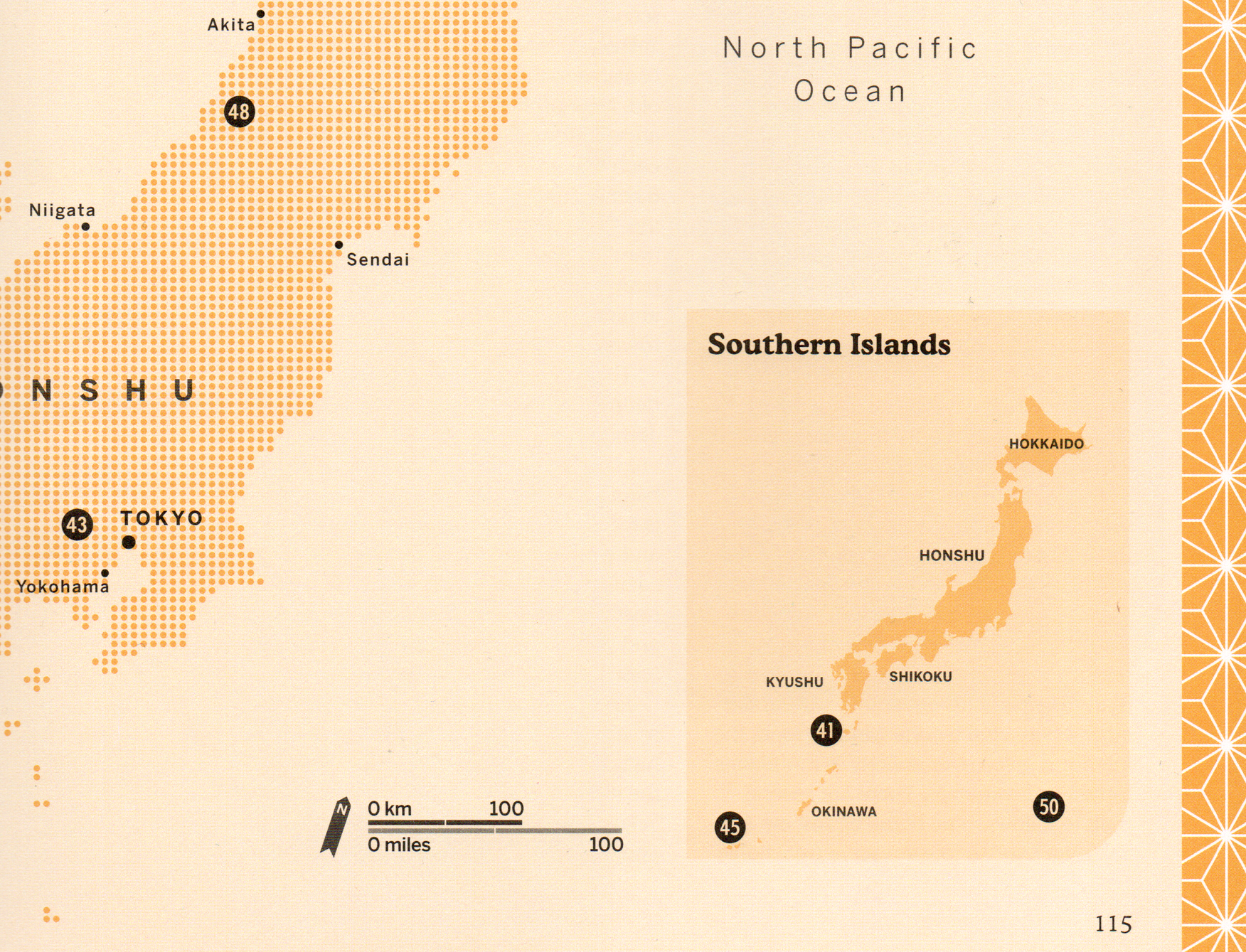
What is important is that the inset map is not perceived to be forming part of the main map. This is visually acheived by titling, adding a unique scale bar and either framing or using a framing device such as tinting the background colour differently from the main map. The map inset boxes in
Ultimate Japan were frameless and tinted darker. In a slightly unusual choice, I did not include a scale for these inset maps as the space available was limited and the main map had a clear scale which could be understood in relation to the inset area.
Credits:
This was another lovely book to work on, with great design by
Laura O’Brien,
Cristina Antequera
and Matt Cox. Gemma Doyle was the design guru whose guidance was so strong.
The author Rebecca Hallett
did a spectacular job of making the country, which is already fascinating, become even more engaging. The senior editor Zoë Rutland fielded the team's queries and requests with a superhuman patience.
Picture research was undertaken by Yoshimi Kanazawa (who I had worked alongside decades ago at Apa Publications).
ISBN: 978-0-2417-6031-4
Project data:
Natural Earth for initial country outline
Openstreetmap for locating sights and towns for route planning
Tools:
QGIS
Adobe Illustrator
Adobe Photoshop